
Related help links:
Create Bins from a Continuous Measure - Tableau
Binning Dates for Custom Date Levels | Tableau Software
Definition:
A Tableau Bin is way to group data (dimension) by incremental values of a numeric field (measure)
Ranking product sales by Qty Sold in selected multiples
The question: What multiples of qty sold generates the most sales for an item?
The answer: create a view showing item sales by multiples of qty sold using Bins.
-
Create a workbook with the _Sales_Invoice data source showing
Item,Qty Sold,Sales. -
To create the Qty Sold Bin, right click on the Qty Sold field, select Create > Bins.
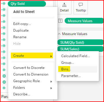
Create Qty Sold Bin
-
Create a Parameter for the user to enter the bin qty value
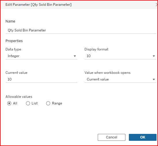
Bin Qty Parameter
-
Edit the
Qty Sold (bin)and set the Size of bins to theQty Sold Bin Parameter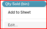
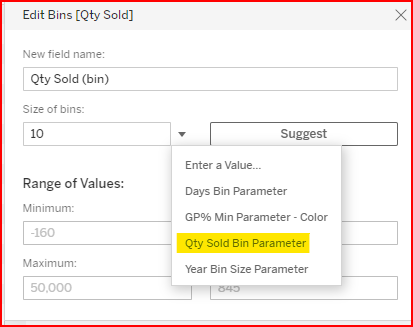
Set the bin size to the parameter value
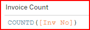
5. Create a calculated field for the number of invoices
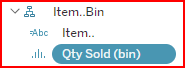
6. (Optional) Create a hierarchy for Item / Qty Sold (bin) enabling you to collapse to the Item level and expand to the Qty Sold (bin) level
7. Sort the rows in Descending order based on the Nested Sales value. This shows the highest sales item as first on the list. Then when the hierarchy is expanded to show the Qty Sold (bin) field, the highest selling bin qty shows first
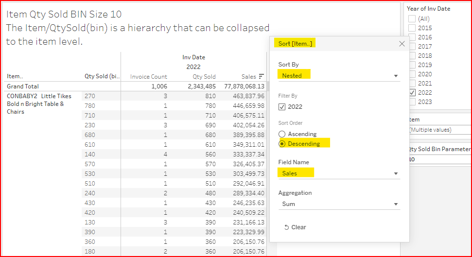
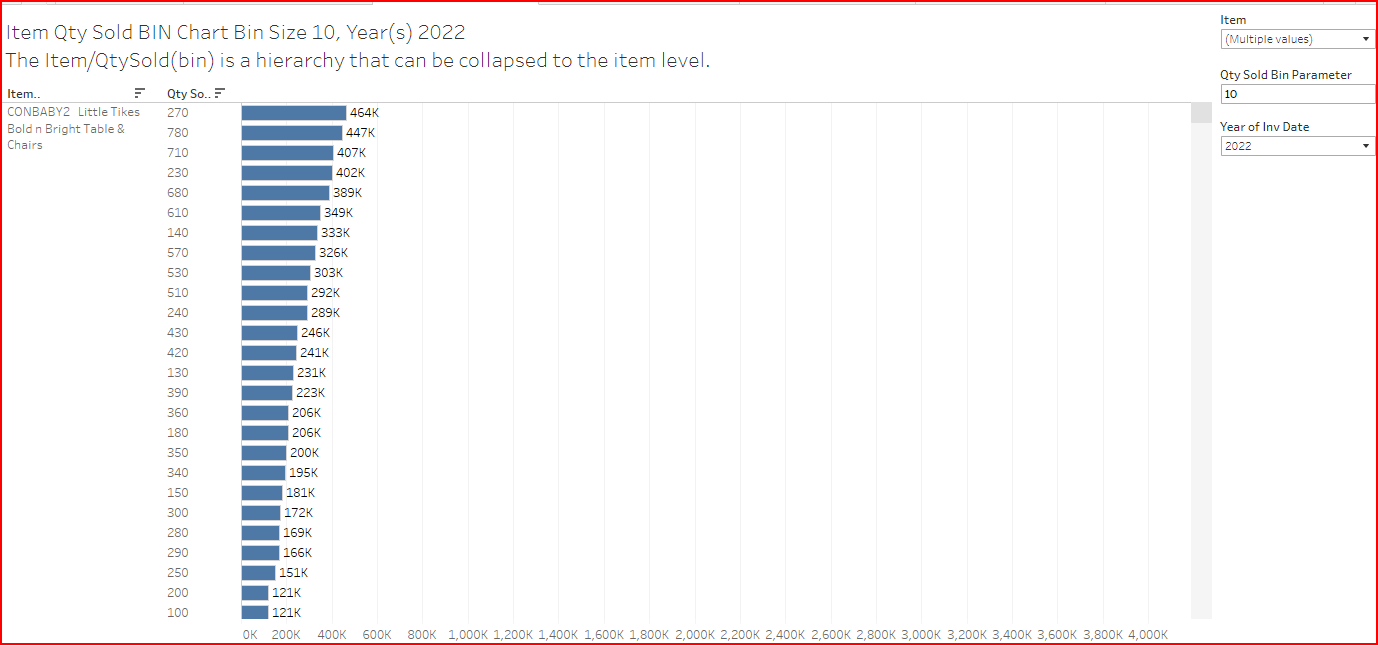
In the example above the highest selling item is CONBABY2.
The 1st highest selling qty multiple is in the 270 to 279 Qty Sold (bin) group.
The 2nd highest selling qty multiple is in the 780 to 790 Qty Sold (bin) group.
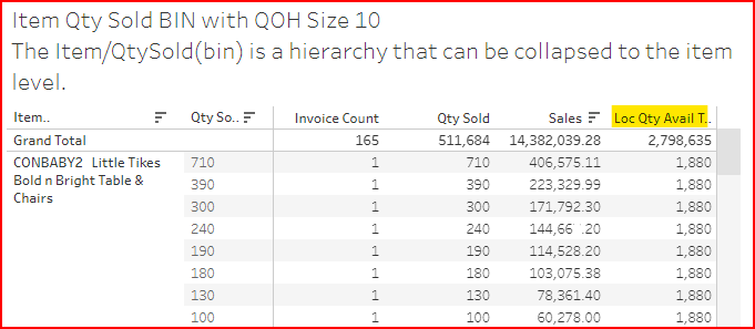
CONCLUSION: Check that you keep enough QOH so you can fulfill those sales.
Sales by Bin Qty with QOH example
Using the Tableau data blending feature, add the IN_OnHandToday data source and show the current QOH
02a Bins: Item Qty Sold BIN with QOH - DataSelf Analytics
Sales by Bin Qty as a Chart example
Sometimes a graphical representation is more meaningful to show patterns or differences.
See an example at 02a Bins: Item Qty Sold BIN Chart - DataSelf Analytics
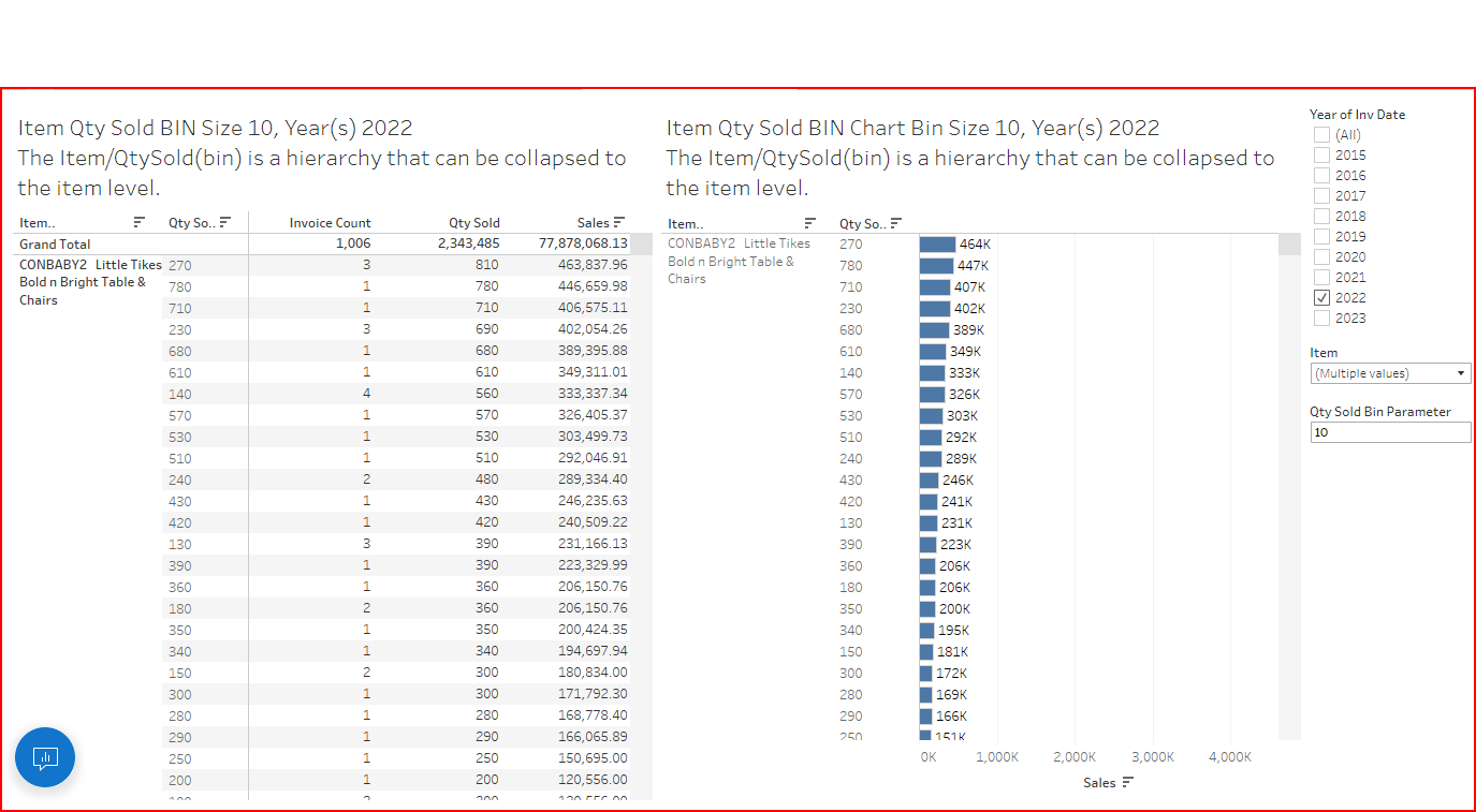
Sales by Bin Qty Dashboard showing both table and chart example
Sometimes it is beneficial to show both the table & graphical views together like this example,
02a Bins: Item Qty Sold Bins Dashboard - DataSelf Analytics
Comparing sales by multiyear groups (bins)
You already know how to group sales by year and use table calculations to show the % difference between years. But how do you show the differences between 5-year increments? Using bins you can group in multi-year increments. See the example at 02a Bins: Sales by Year Bins1 - DataSelf Analytics
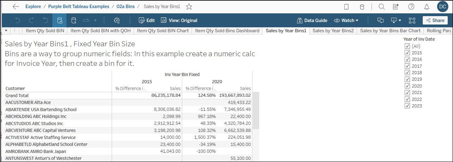
The requirement is to create a numeric value for the date field. In these examples the Invoice Year is being “binned”.
-
Create a calculated field for YEAR([Invoice Date])
-
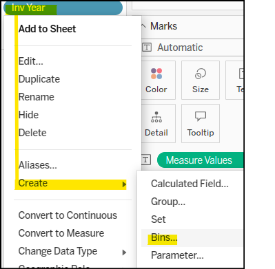
Right click on the calculated field and create Bin
-
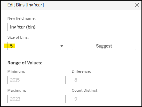
Enter the Bin Size to group years. In this example the Invoice Year is being grouped (binned) in 5-year multiples
-
Here is an example of using a parameter to set the year bin size:
02a Bins: Sales by Year Bins2 - DataSelf Analytics
Looking at past sales from Today in 30-day bin groups
With bins you can look at sales history relative to today in multi-day increments. With a parameter, you choose the increment. See an example at 02a Bins: Rolling Parameter Days Sales Bins Tabular - DataSelf Analytics
-
Create a calculated field showing the invoice date relative to number of days from today.
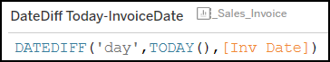
Using DateDiff to calculate number of days between invoice date & today -
Create a bin based on the DateDiff calculated field. Set the bin size to your choice
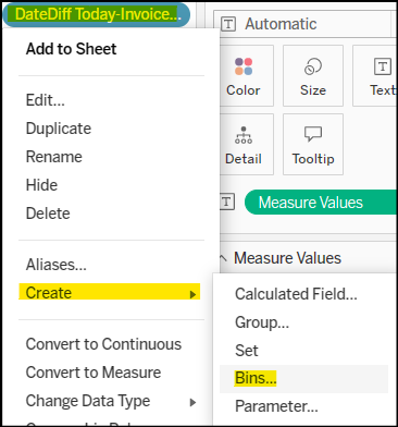
DateDiff Bin -
To make the bin size customizable, create a parameter to control bin size.
-
If you want more detail on the date groups of each bin, create calculated fields for MIN([Invoice Date]) & MAX([Invoice Date]) and add them to the Rows section.
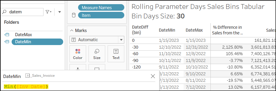
The DateMin&DateMaxfields show the date rang of each bin -
To see the difference in the sales amount between bin groups, create a table calculation for % Difference from previous row as shown in the example above.
-
These are examples of displaying the data graphically to show the difference more effectively
In the first two views, theDateDiff (bin)is the Column Footer. TheDateMincan show as a ToolTip or a Label.
02a Bins: Rolling Days Sales Bins Bar Chart Asc - DataSelf Analytics,
02a Bins: Rolling Days Sales Bins Bar Chart Desc - DataSelf Analytics
In the following two views,DateDiff (bin)is marked as a color to provide the grouping.DateMinis the Column Footer
02a Bins: Rolling Days Sales Bins Bar Chart Asc 2 - DataSelf Analytics
02a Bins: Rolling 30 Day Sales Bins Line Chart - DataSelf Analytics