Orange Belt: Report Design Part 4
1. Groups
You can create a group to combine related members in a field. For example, to create sales territories, or group customers that belong to the same parent company, or to correct data errors (e.g., combining CA, Calif., and California into one data point), or answering "what if" type questions ("What if we combined the East and West regions?).
Groups can be created inside of a workbook, at the data source level or as a Viewer. For an example, let’s create a group to combine salespeople into two territories:
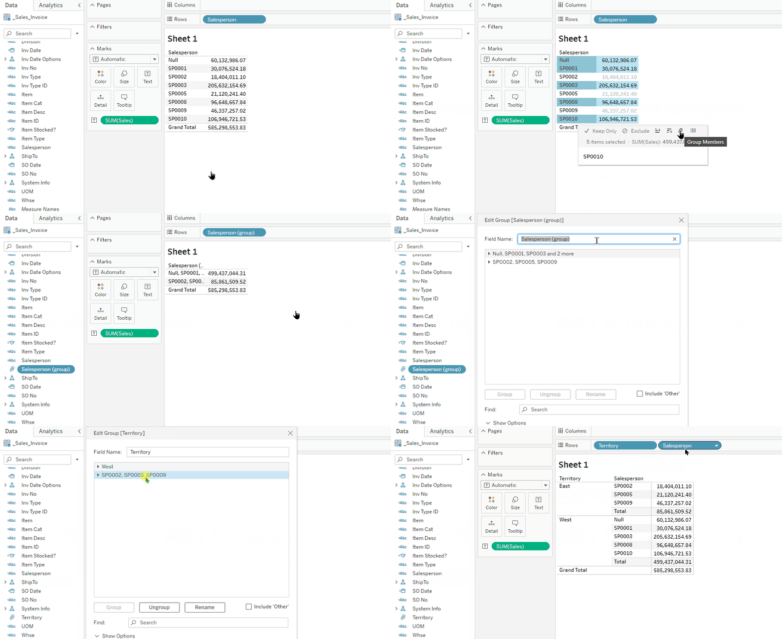
Starting with a Sales by Salesperson report, select a few Salesperson entries that would belong to the same territory. Press and hold the Ctrl button to select multiple entries.
On the pop up, click the Group Members icon (paperclip icon) to group the entries.
Select the next entries (press and hold the Ctrl button to select multiple entries) → click the Group Members icon on the pop up.
To rename the new group dimension and its members, right-click the new group dimension → Edit Group → Rename the group title as well as each entry. You can also use this Group Editor to move members into other groups.
To view the group dimension and it’s original dimension, drag the original dimension to the right of the group on the report. You might also want to make a hierarchy with these two dimensions to drill down from the group to the individual dimension.
See the following video.
Hands On Exercise
Create groupings based on ShipTo State. Suggestion: use a map chart and select states on the map (tip: press the letter D to activate the Lasso mouse selection).
How to enhance Grouping with drill down features
You can create a hierarchy for your group, (i.e. sales territory) , to drill down to salesperson, customer, invoice #, item.
Other features like Groups
Sets
The Set function is designed to be used in the Desktop App. But it does have some application in the Web App, primarily as a quick way to create filtered subsets of records.
i.e. to create a set of specific customers you want to track, highlight all of them and click on the icon to Create Set
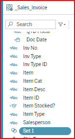
A new Dimension will display in the Data Pane called Set1, which you can rename.
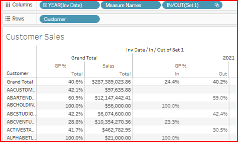
The Set dimension is a True/False calculation identifying records IN/OUT of the set.
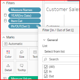
You can use the Set as a filter to select only those records In or Out of the set.
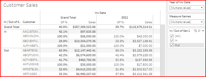
You can show the filter to change your In/Out selection. And you can add the Set1 field as a row or column
  |    |
 |  |
Bins
Bins is a function of measure fields to group transaction records within ranges of amounts.
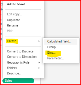
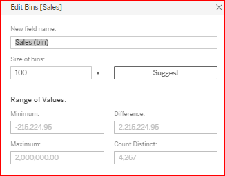
In the example below, the Sales measure was used to create a Sales Bin in groups of $100 increments.
 |  |
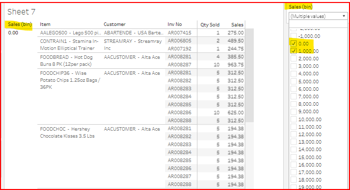
In the example below, the Sales (bin) dimension groups the transaction records into groups of 0 - 100 and 101 - 200. The filter for the Sales (bin) is shown and only the 0.00 & 1,000.00 values are selected.
The most common way bins are used is in histograms to show line item sales in bin groupings. You can use the Show Me wizard for this. In the example below only the sales measure was highlighted when the Show Me wizard was selected. It suggested for one measure and automatically created a bin for that measure and a bar chart showing the transaction count of sales records per bin group.
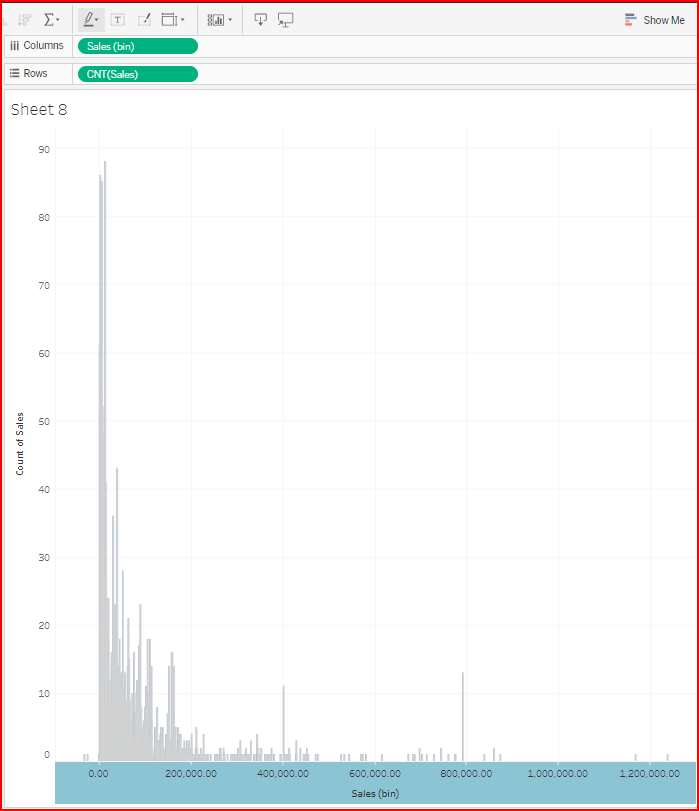
Another use of Bins is to combine them with Sets and Table calculations. In the example below The Bin for 0-1000 was selected as a Set, The Set was used as a row dimension and a Quick Table Calculation for % of Total Sales shows what % was from transaction lines <= 1,000.

There are multiple ways to achieve this output. Bins is only one of the options.
2. Reporting Across Data Sources
Via Tableau Blends
Tableau blends are an easy and powerful way to combine measures from different data sources into a single report. These blends work as left joins. Meaning, the blend includes all records from the main source and only matching records from the other data sources. Data Blends have limited functionality because they only link a single aggregated amount. Multiple records will display an asterisk * instead of the actual values.
See the Tableau Help topic: Blend Your Data - Tableau
Let’s see an example blending Sales Invoice and AR Aging Today data sources:
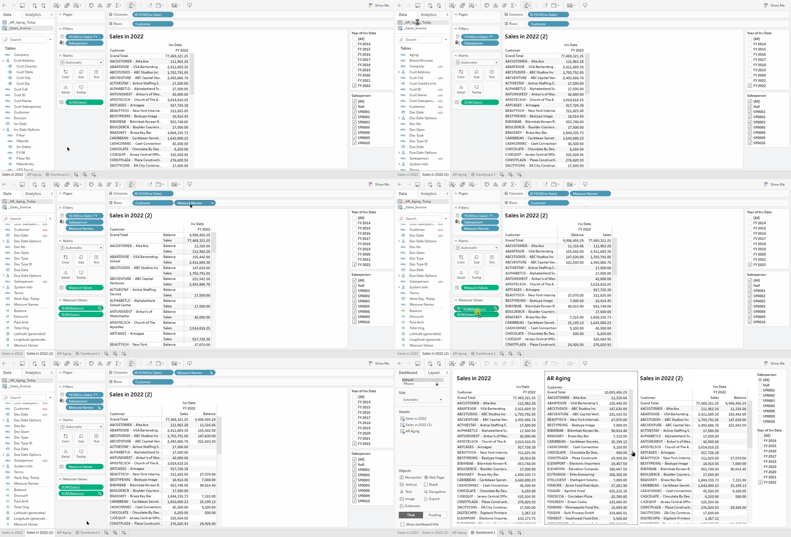
Create a Sales by Customer in 2022 report (see image below for how it should look).
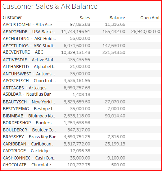
Click menu Data → New Data Source → select _AR_Aging_Today → Connect.
From the just added data source left panel, drag and drop Balance measure onto the report measure area → rearrange the layout for better visibility by moving Measure Names from Rows to Columns, and putting Balance after Sales.
Note that the Balances green pill in the Measure Values shelf has an orange mark which is associated to a different data source.
Go to the dashboard tab and drag and drop the new sheet onto the right area of the dashboard.
Note that the Balance Grand Total for the AR Aging report is not matching with the new blended report. Why? Because on the new report, the blend’s left join is only showing Balances for Customers that are listed in the Sales report.
Customers with AR Balances from prior years and that haven’t had sales in FY 2022 are not listed in this report.
For some use cases, this is exactly what this report should be showing.
But if this report must show all customers with AR Balances regardless of their sales, then blending will not work. In such cases, use the Via Dashboard above or Other Methods below.
Hands-on Exercise
Add Open Sales Order Amt by Customer to the blended report above.
Via Dashboards
You can combine views from multiple data sources into a single dashboard. And then you can use fields that have the same name and function across the data sources to filter the dashboard.
For an example, let’s put together a dashboard showing FY 2022 Sales by Customer with a Salesperson filter, and then add an AR Aging by Customer report:
Build a FY 2022 Sales by Customer report, set Grand Totals at the top, add the Salesperson filter.
Create the AR Aging by Customer report:
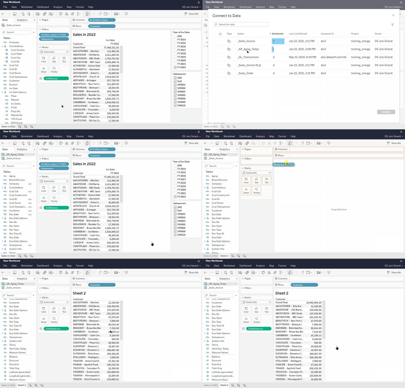
Add the _AR_Aging_Today data source to the workbooks by going to the menu: Data → New Data Source → _AR_Aging_Today → Connect.
On a new tab, be sure the _AR_Aging_Today is selected on the Data tab top section, and create a report showing Balance by Customer, set Grand Totals at the top.
Note that the data source connected to a view has blue checkmark on its bottom right.
Combine both reports into a dashboard:
Click New Dashboard icon → set its Size from Fixed size to Automatic, drag the Sales report into the dashboard area, drag the AR report into the right of the dashboard area.
Note that the two filters added to the dashboard only affect the Sales report.
Since the Salesperson dimension is present on both data sources (same dimension name and function), let’s set this filter to work across all associated data sources:
Click the Salesperson filter card on the right panel → click the arrow down on the top left (or top right) of the gray box around the Salesperson filter card → Apply to Worksheets → All Using Related Data Sources.
Now change the Salesperson filter selections and it’ll affect both reports.
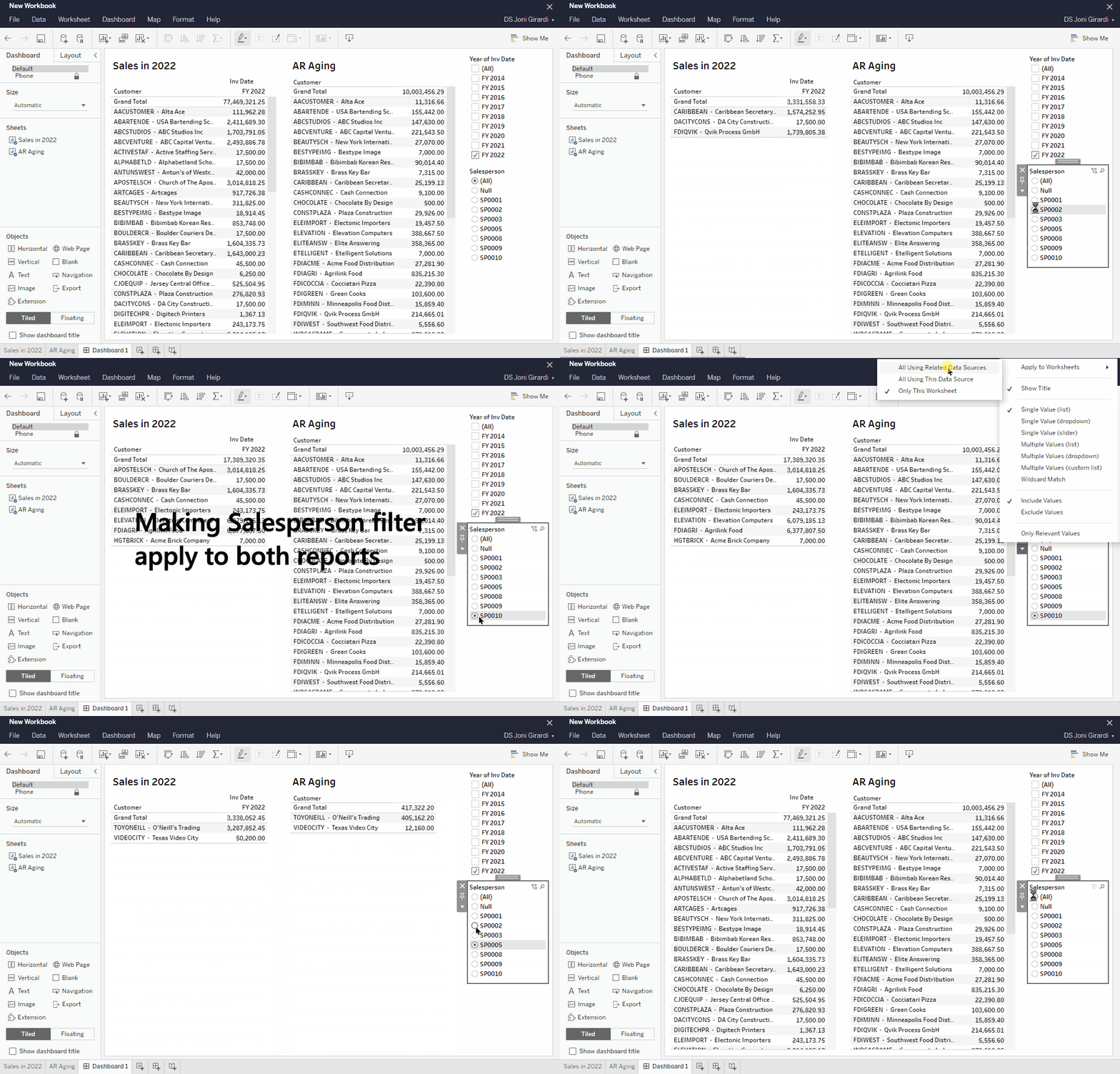
You may also set each report to Use as Filter (click on a report on the dashboard, click the arrow down on the top left or right of the gray box around the report → Use as Filter) to filter the dashboard by Customer (which is also a dimension shared by both data sources).
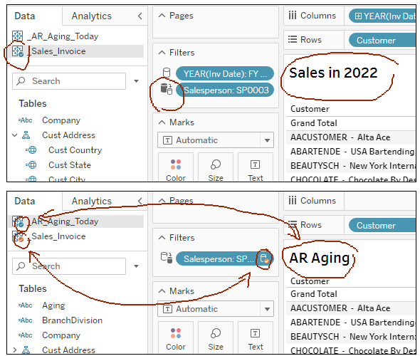
Let’s learn a few visual cues of how the Salesperson filter is working across both data sources:
Go back to each of the two report tabs, read the following and look at the image below.
Sales report: notice that only the _Sales_Invoice data source (top left panel) is connected to this report and its Salesperson filter (Filters shelf) has an icon with two cylinders representing a filter working across related data sources.
AR Aging report: notice the blue checkmark on the data source indicating its data feed, but then the orange checkmarks indicating that the Salesperson filter from another data source (_Sales_Invoice) is applied to this report.
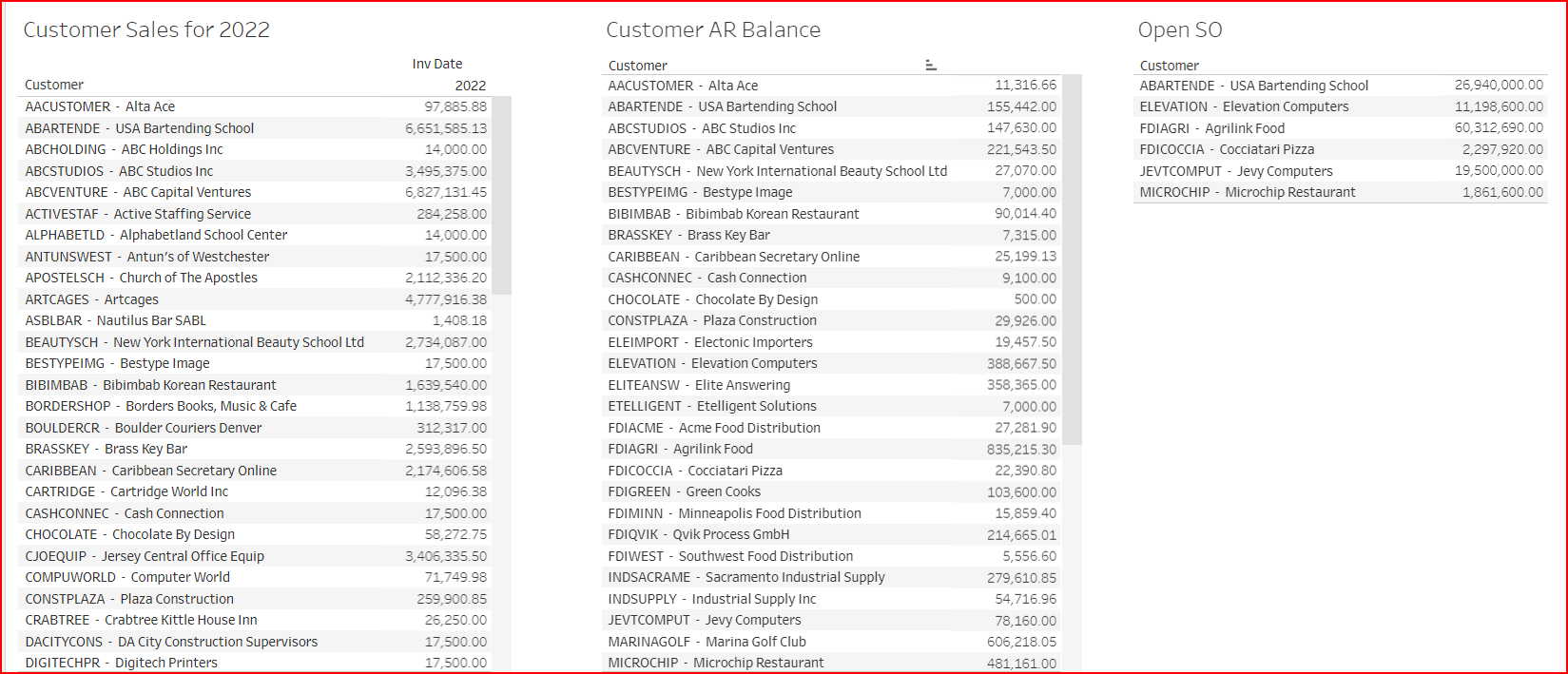
Hands-on Exercise
Add to the dashboard above an Open Sales Order Amt by Customer.
Other Methods
There are several other methods to report across data sources that are more powerful and more flexible than data blends, for instance:
Use Tableau Desktop to edit data source joins (supports left, right, equal and full joins). Learn more.
Use Tableau Desktop to edit relationships (noodle joins). Learn more.
Use Tableau Desktop to edit table unions. Learn more.
Use DataSelf ETL+ and/or MS SQL data warehousing to do the table joins and unions.
3. Custom Views with pre-set filters and settings
There are times when it is helpful to have the filters, hierarchy, and other settings already set so a viewer does not need to figure out the combinations to get the data they need.
It’s also helpful when you set up viewer subscriptions to get an email of the view.
This can be accomplished with the Custom View feature, which is set up in View mode, not Edit mode.
The example below shows the default view of the Sales by Territory worksheet. Note the View setting says Original.

I want to set the filter for only 2022 sales for Western territory, and expand the hierarchy to show the sales people, and save that as a Custom View so any viewer can select it.
Enter the selections and settings.
Click on View: Original to view the dialog box.
Enter the view name and check if you want this view to be visible to others. Save the custom view.
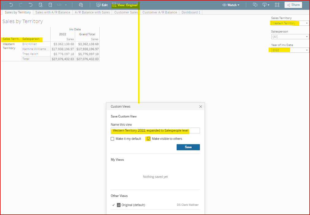

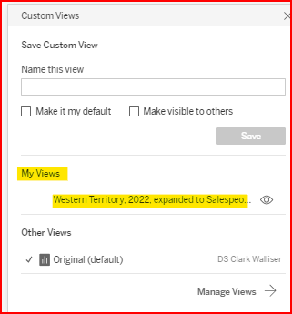
To revert back to the Original View, click on the View icon and select Original (default)
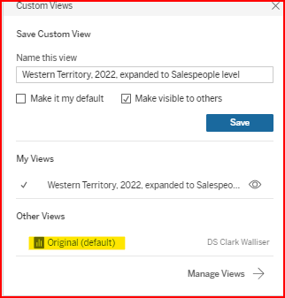

Custom views are also useful when setting up subscriptions

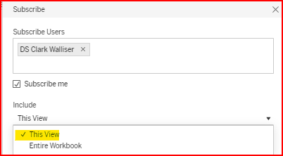
Select the Custom View you want the subscriber to see before creating the subscription
Select This View to send the Custom view
Using the Data Guide to inform the viewer.
4. Dashboard Objects and Layout
Objects
The following objects provide helpful features in dashboards:
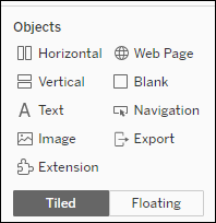
Horizontal and Vertical: see section down below.
Text: Free text objects.
Image: Insert images into your dashboard - they can also be configured to work as links to other pages.
Extension: Might not be available. Consult DataSelf.
Web Page: Insert other web pages into your dashboards.
Blank: A blank object.
Navigation: Buttons to navigate to other tabs in the same workbook.
Export: Buttons to export your dashboards to PDF, image or PowerPoint.
Layout
The dashboard Layout tab provides controls such as:
Floating versus tiled widgets
Position and Size: helpful when using floating objects
Border for widgets
Background colors for widgets
Outer and Inner Padding for widgets
These controls usually provide better real dashboard estate usage as well as making them better looking. See the example in the Horizontal and Vertical Containers below for some inspiration.
Horizontal and Vertical Containers
Horizontal and Vertical containers provide more control of a dashboard layout such as defining the sizing of each widget, how to distribute the widgets (ex.: distribute sizes evenly or keep some with fixed sizes while others with variable sizes), and “pixel-perfect” layouts.
These containers can be a bit challenging to understand and use at first. Those of you who care about beautifully designed dashboards, you might want to invest your time to get a hang of containers.
Dashboard Layout and Containers Example
The following is the dashboard built at the end of the training part 3 with no special design refinements.
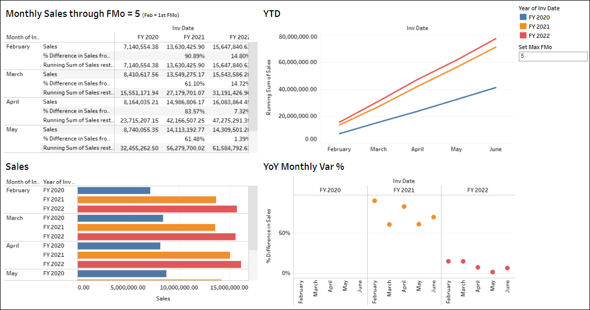
And the following is the same information using containers and layout adjustments. Note that three widgets (grid, sales bars and Var % circles) were combined and aligned to look like they are a single widget (inside of the gray border).
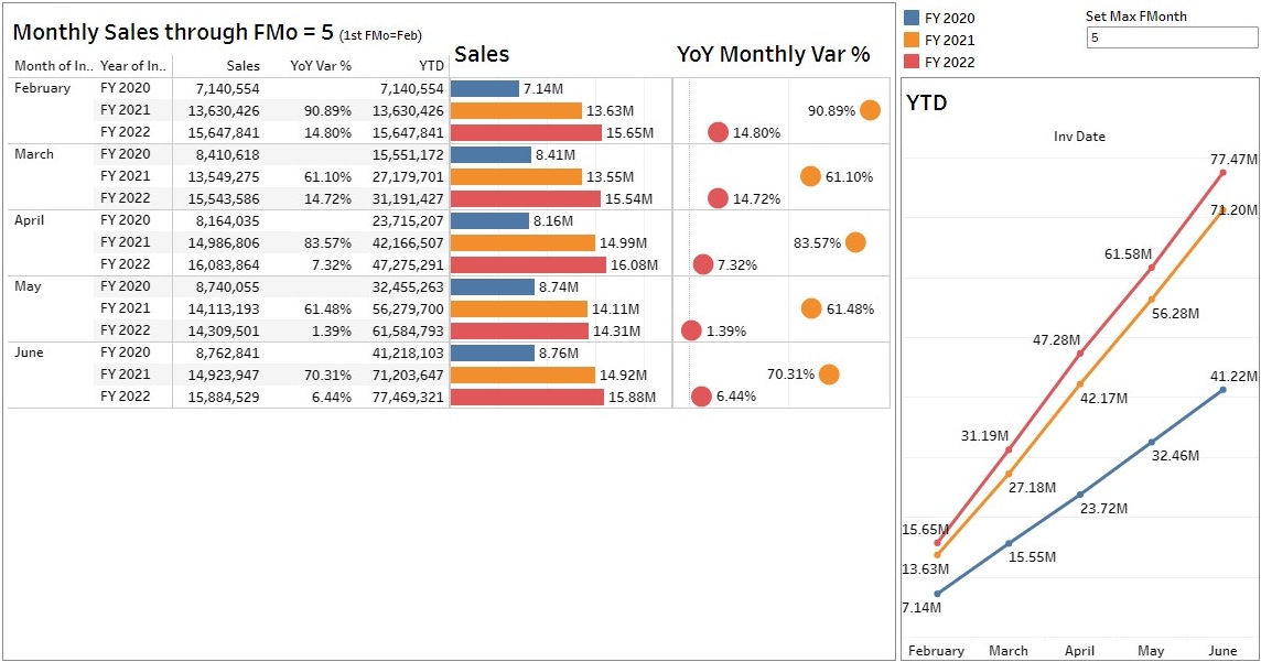
Please watch the YouTube below to view how to get from the first to the second dashboards above. Click the YouTube icon on the bottom right to view it bigger and even in full screen from YouTube’s page.
