The Personalized Visual feature in the Power BI service allows the end-user to personalize a particular visual. Maybe they'd want to swap what's on the axis, change the visual type, or add something to the tooltip. It's hard to make one visual that satisfies everyone's requirements. They can adjust the visual the way they want, and save it as a bookmark to come back to. They don't need to have edit permission for the report, or to go back to the report author for a change.
What report users can change
-
Change the visualization type
-
Swap out a measure or dimension
-
Add or remove a legend
-
Compare two or more measures
-
Change aggregations, etc.
Report Author: Enabling personalization in a report
You can enable this either in Power BI Desktop or in the Power BI Service.
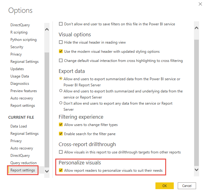
Enabling in Power BI Desktop
To enable the feature in Power BI Desktop, go to File > Options and settings > Options > Current file > Report settings. Make sure Personalize visuals is turned on.
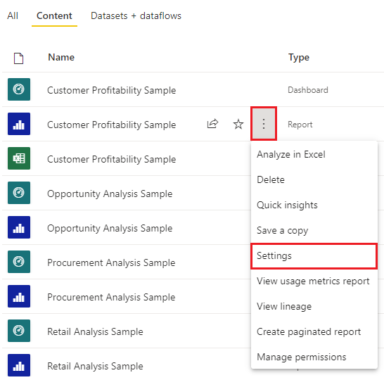
Enabling in Power BI Service
To enable the feature in the Power BI service instead, go to Settings for your report.
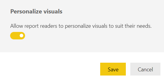
Turn on Personalize visuals > Save.
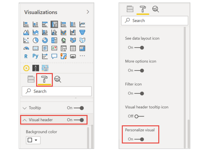
Turn the feature on/off at a page or visual level
When you enable Personalize visuals for a given report, by default all visuals in that report can be personalized. If you don't want all the visuals to be personalized, you can turn the setting on or off per page or per visual.
Per page
Select the page tab > select Format in the Visualizations pane.
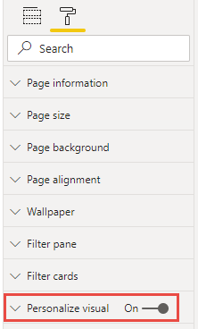
Per visual
Select the visual > select Format in the Visualizations pane > expand Visual header.
Use Perspectives for a more focused view
For Personalize visuals, you can use Perspectives to choose a subset of a model that provides a more focused view. Choosing a subset can be helpful when working with a large data model, allowing you to focus on a manageable subset of fields, and not overwhelm report readers with the full collection of fields in that large model.
See https://dataself.atlassian.net/wiki/pages/createpage.action?spaceKey=DS&title=Perspectives&linkCreation=true&fromPageId=1606385711 for more information.
Instructions for the End-User in the Power BI Service
By personalizing a visual, you can explore your data in many ways, without leaving report reading view. The following examples show different ways you can modify a visualization to meet your needs.
-
Open a report in reading view in the Power BI service.
-
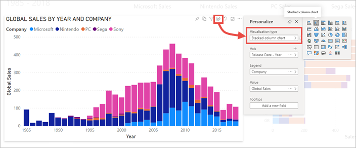
In the menu bar for the visual, select the Personalize this visual icon.

Change the visualization type
Do you think the data would display better as a Stacked column chart?
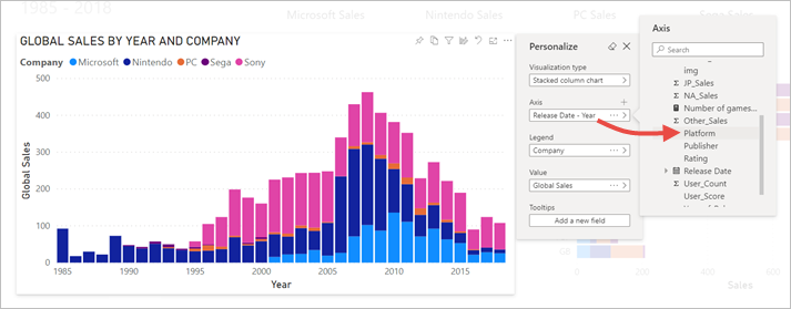
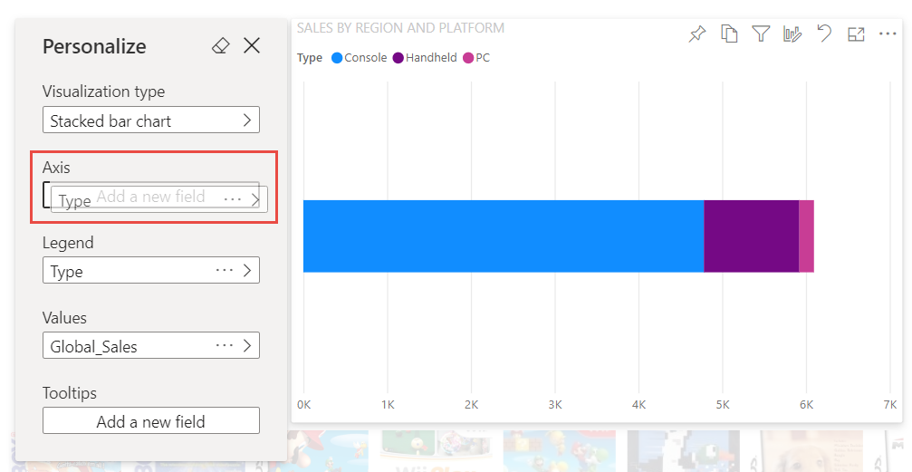
Swap out a measure or dimension
Replace the field being used for the X axis by selecting the field that you want to replace, then selecting a different field.
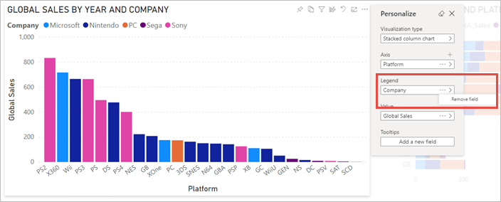
Add or remove a legend
By adding a legend, you can color-code a visual based on a category. In this example, we're color-coding based on company name.
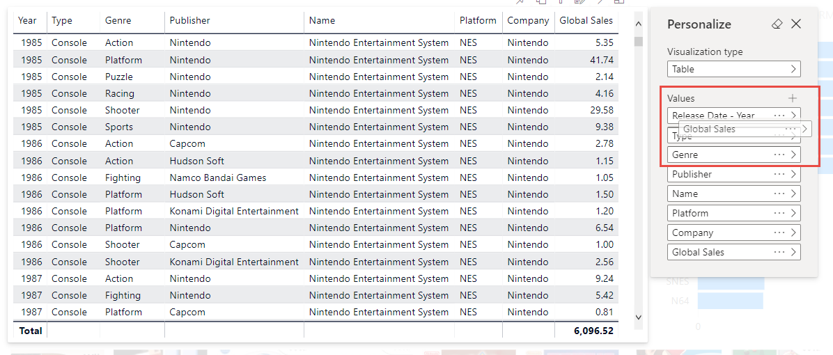
Change the placement of fields
Using drag and drop, you can change the placement of fields within the same visual property or even across different visual properties. For example, you can quickly move a field in the legend to the axis of a visual.
You can also quickly reorder the columns of a table or matrix.
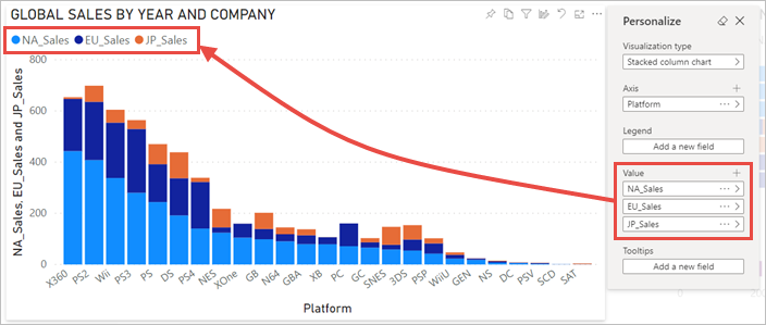
Compare two or more different measures
Compare and contrast values for different measures by using the + icon to add multiple measures for a visual. To remove a measure, select More options (...) and choose Remove field.
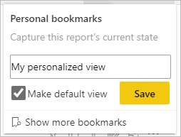
Capture changes
Using personal bookmarks, capture your changes so you can return to your personalized view. Select Bookmarks > Personal bookmarks and give the bookmark a name. You can also make the bookmark your default view.
Share changes
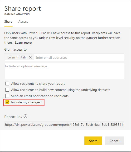
If you have read and re-share permissions, when you share the report you can choose to include your changes. This personalized version does not overwrite the author's version. The colleague who is viewing your personalized report can select Reset to default and return to the author's version of the report. If the colleague has editing permissions, they can save your personalized version as a new report.
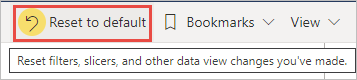
Reset all your changes to a report
From the upper-right corner of your report canvas, select Reset to default. This removes all your changes in the report and sets it back to the author's last saved view of the report.
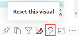
Reset all your changes to a visual
From the menu bar for the visual, select Reset this visual to remove all your changes to a particular visual and set it back to the author's last saved view of that visual.
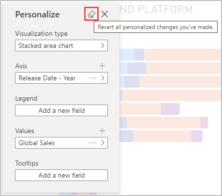
Clear recent changes
Select the eraser icon to clear all recent changes you've made since you opened the Personalize pane.
Limitations
-
Personalize this visual can be turned off for an entire report or for a particular visual. If you don't have an option to personalize a visual, check with your Power BI admin or the report owner. To display contact information for the report owner, select the name of the report from the Power BI menu bar.
-
User explorations don't automatically persist. You need to save your view as a personal bookmark to capture your changes.
-
This feature is supported in the Power BI mobile apps for iOS and Android tablets and in the Power BI Windows app; it is not supported in the Power BI mobile apps for phones. However, any change to a visual you save in a personal bookmark while in the Power BI service is respected in all the Power BI mobile apps.
GIF Example