
Table of Contents:
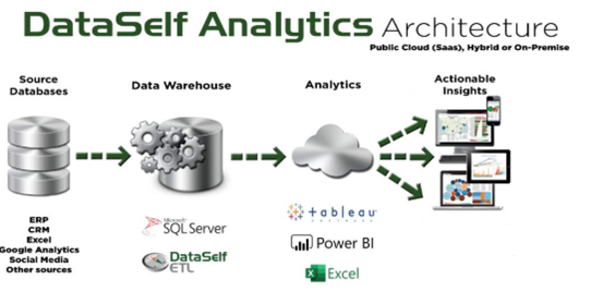
1. DataSelf Architecture
-
Data warehouse: DataSelf ETL+ extracts the data from the source system(s) into a MS SQL Server data warehouse for a single version of the truth, data consolidation, ease of reporting and fast performance.
-
Analytics: Streamlines the data sources for easier reporting design and distribution.
-
Actionable Insights: Preconfigured views and dashboards provide value on day one, as well as allow users to easily perform ad hoc analysis and create new views.
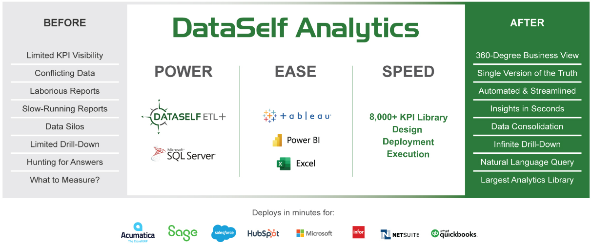
The DataSelf Value Proposition:
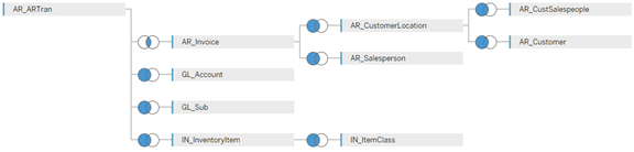
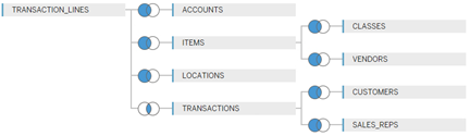
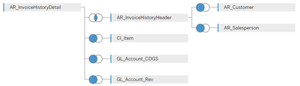
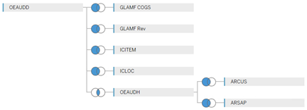
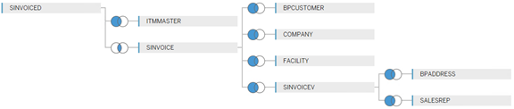
2. Examples of the pre-built _Sales_Invoice data source based on different ERP sources.
This is what DataSelf did behind the scenes to create the _Sales_Invoice data source you see in Tableau.
The star schemas shown below are examples of Sales data feeding the Workbook Editor’s Data panel. Editing the star schemas requires user licenses for DataSelf Tableau Desktop and MS SQL.
Addition of existing ERP fields to tables in the star schema requires an ETL+ user license to edit DataSelf ETL+.
Acumatica
NetSuite
Sage 100
Sage 300
Sage X3
3. Sign in to DataSelf Training Site
-
Go to https://dataselfbi.com
-
For Class training, sign in with:
-
User:
Student_01 -
Pw:
Student_2025
-
-
For Self-Serve training, sign in with:
-
User:
orange -
Pw:
Orange_2025!
-
-
If prompted to Select a Site, select training_orange.
4. Creating a new workbook
Tableau help links: Sign in and explore projects, Tour Your Tableau Site - Tableau
-
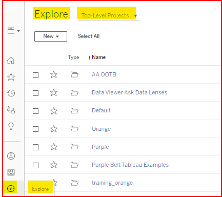
Click on the Explore icon in the left panel to list the
Top-Level Projects. -
-
Click on the New button and select Workbook
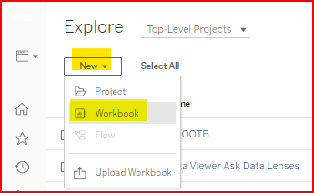
-
Select a data source by either double clicking on it or clicking once to highlight the data source then clicking on the Connect button in the lower right. For this training, select _Sales_Invoice.
Tableau help link: Connecting to Data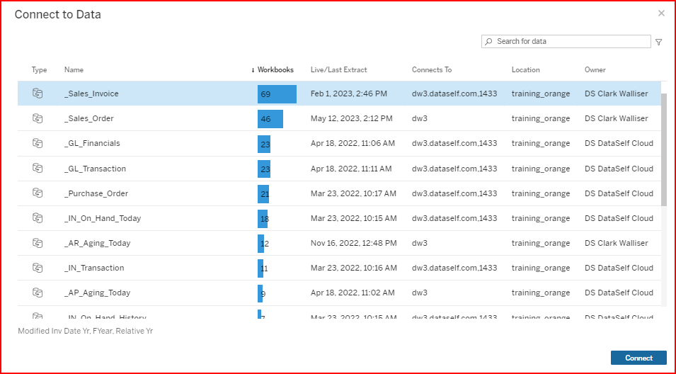
5. Workbook Editor Main Areas
Tableau Help: Getting Started with Web Authoring
-
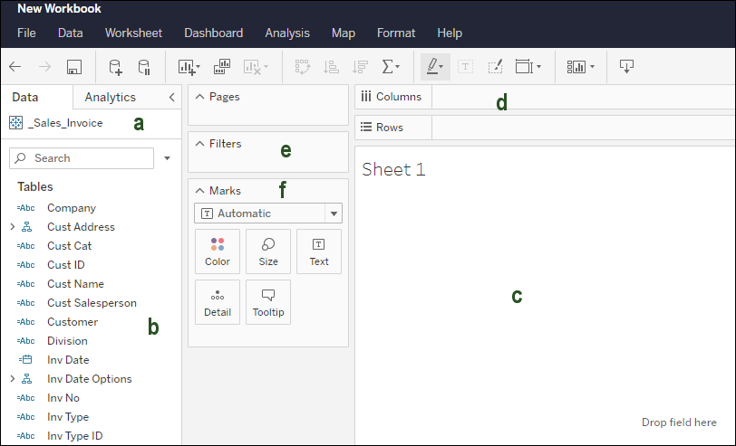
Main areas of the Workbook editor:
-
Data source for workbook: (additional data sources can be added later).
-
Data structures for reporting:
-
Dimensions (top section): non-numeric data fields for grouping by rows and columns.
i.e., Adding the Customer field to the Rows section will display a row for each customer and will subtotal (aggregate) numeric data by each Customer group. -
Measures (bottom section): numeric data fields to subtotal (aggregate) for the most detailed Dimension group. i.e., Qty Sold by default will display the Sum of the Qty Sold number for each invoice line grouped by Customer.
-
-
The View area, where you see the output display of your work.
-
Sets the Workbook’s Rows and Columns.
-
Sets the Workbook’s Filters.
-
Sets the Workbook's Marks.
-
Tableau Help Link: Edit Tableau Views on the Web
6. Drag and Drop, creating a basic view
Activity 1: How to create a view showing Sales by Customer.
-
In Step 4 you created a new workbook connected to the _Sales_Invoice data source.
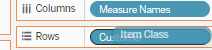
From the top Dimensions section of the data panel on the left, drag theCustomerdimension field into the Rows section. -
From the bottom Measures section of the data panel, either double click on the
Salesmeasure to let Tableau auto-add it or mouse-drag theSalesmeasure into the Abc area on the View section.
The Abc indicates you are displaying a numeric measure value as text rather than color or size. -
The Sales by Customer view is done!
FYI: If you want to undo steps, clear the sheet or start a new sheet:
7. Filters, adding additional sheets and fields.
Filters control which records are included or excluded based on the value of a dimension or measure.
Tableau help link: Filter Data from Your Views - Tableau
Filter Method 1: Show Filter for a field on the sheet.
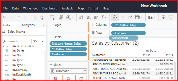
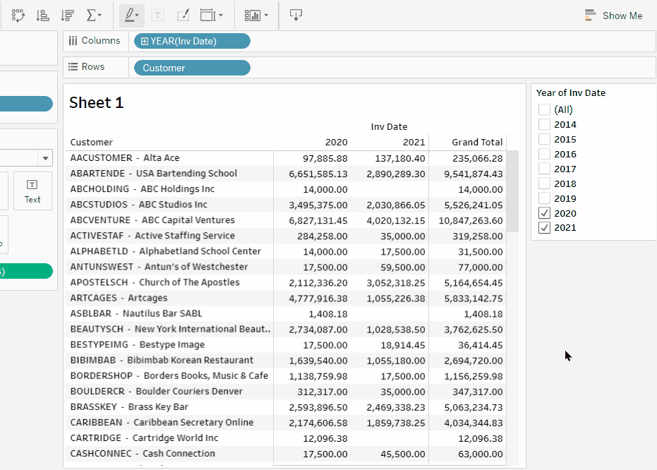
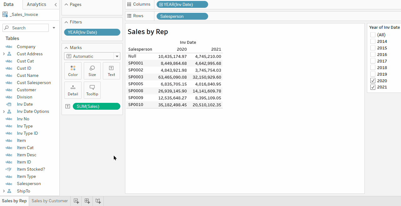
Activity 2: Modify Sheet 1 (Sales by Customer) and add a column for Invoice Date (year).
Then right-click, select Show Filter, and select only 2 years.
-
Drag
Inv Dateto the Columns (top center section). Notice it automatically groups it by Year. -
Right-click the
YEAR(Inv Date)dimension field on the Columns. Select the Show Filter property. -
In the Year of Inv Date filter on the right, unselect All, then check the boxes for the last two years.
-
Right-click the
Customerdimension field on the Rows and select Show Filter. -
Rename the sheet. Right-click Sheet 1 and rename it to Sales by Customer.
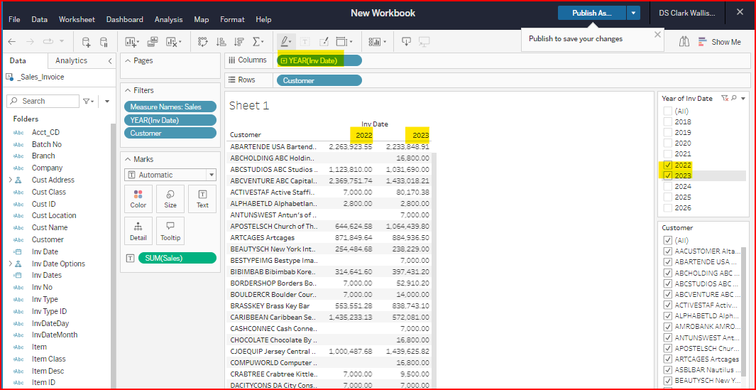
Example of Sales by Customer with Invoice Year & Customer filters
You can also drag dimensions and measures directly from the Data panel to the Filters section (center panel). This method often shows more Filter options. But it does not automatically show the filter on the right, so you need to right click and select Show Filter. We will go over this method in more detail for date fields on Part 2.
Filter Method 2: Add field to the Filter, then show the filter.
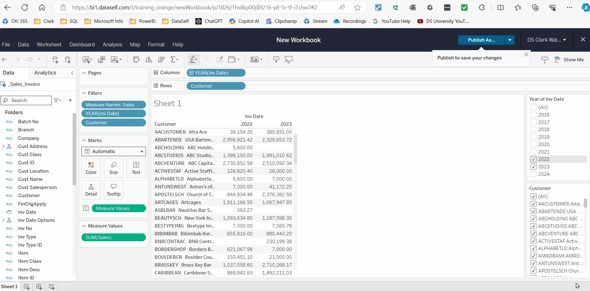
Activity 3: Drag Salesperson to the Filters section, then right click to Show Filter and select salespersons in the panel on the right side.
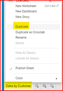
Creating multiple sheets.
A Tableau workbook can contain multiple worksheets. These sheets are also described as views and tabs. There are two Methods to create a new sheet.
Method 1: Duplicate an existing tab.
If you want to make use of the structure you created in an existing view to create another sheet/view, right-click on the existing worksheet tab and select Duplicate. This will create a new sheet with a (2) after the original’s sheet name. Then you can modify the Rows and Columns as desired.
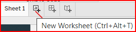
Method 2: Create a new tab:
Click on the New Worksheet icon and create a new view from blank. Note you can create sheets, dashboards, and story tabs.
Overwriting vs inserting fields to the sheet.
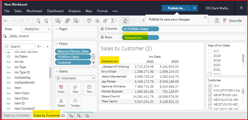
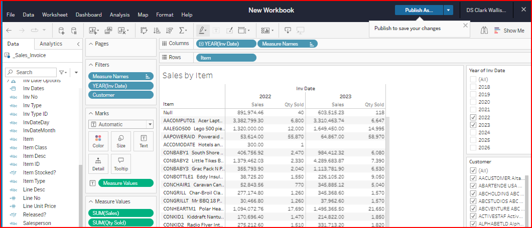
Activity 4: create two additional views: Sales by Salesperson, Sales & Qty Sold by Item.
Name the Item view Sales by Item.
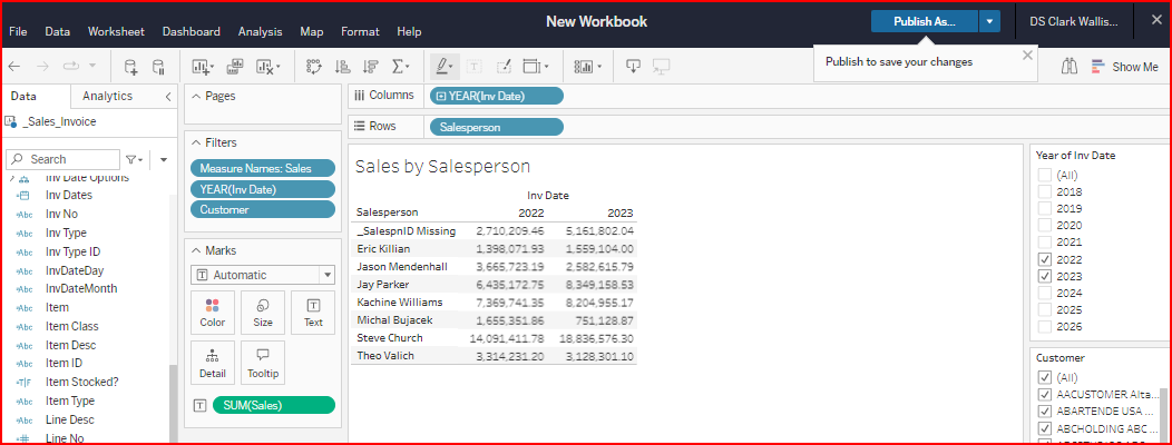
In the examples above, the Row Dimension was changed to the new field, but the filters did not automatically change. To remove the old Filters, right click on the desired field in the Filters section and select Remove.
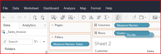
The measure column headers automatically appear when multiple measures are displayed.
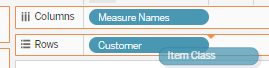
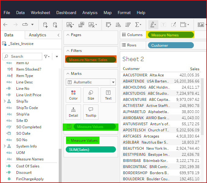
Notice that Tableau added a Measure Names field to the Columns section, Measure Names to the Filters section, Measure Values to the Marks section, and added a new section below the Marks called Measure Values.
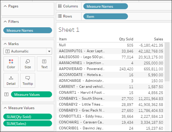
Measure Names field was added to the columns. This happens automatically when a 2nd measure is added.
How to see a column header for only one measure
As you noticed above, when only one measure is selected, there is no column header (measure name), but when a second measure is added the Measure Names field is automatically added to the columns or rows, and you see column headers.
You can manually do the same process to see a column for only one measure.
After you have added the measure field to the report area, drag the Measure Values field to the Abc section of the report area, where the measure numbers display.
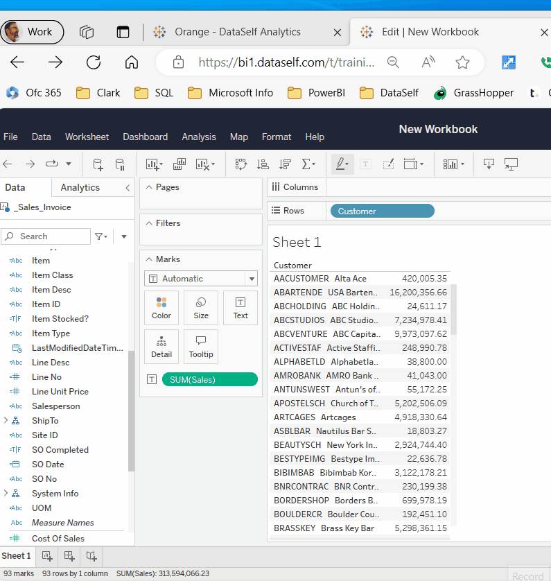
Tableau Help Link: The One-Click Trick to Creating Headers for Single-Measure Tables (tableau.com)
When you add the Measure Values to the Abc section, it does 3 things.
-
III Adds the
Measure Namesfield to the Columns or Rows, depending on what Tableau's AI logic decides. -
III Adds the
Measure Namesfield to the Filters section. We will cover this feature more in part 2 -
III Adds the
Measure Valuesfield to the Marks section, and creates a new section below called Measure Values which lists the individual Measures displayed on the view.
8. Publishing (Saving your work)
Saving/Publishing applies to the whole workbook. Workbooks are like Excel files, containing one or more sheets (also call tabs or views), which are like Excel tabs/sheets.
Activity 5: Publish your workbook
-
Click File → Publish As. Or use the Publish icon in the upper right corner.
-
Name the workbook. For this training course, user your name with a number suffix. i.e., “Pat Smith 2”
-
Check Show sheets as tabs (You can change this setting after the fact. You’ll see later what it does).
-
Click Publish.
-
Options to save next time:
-
File → Publish
-
Click the Publish icon in the top right
-
Ctrl+S.
-
Exiting the Edit Mode
-
Click File → Close
-
Or click the white X on the top right of the black ribbon.
-
If the workbook has been published/saved, you will return to the explorer page.
-
If the workbook still displays, notice it is Viewer mode. There is no data pane to add fields, etc.
Returning to the Edit Mode
-
From a worksheet or dashboard tab, click the Edit icon on the top left icon menu.
-
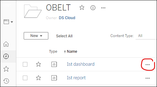
From the list of workbooks or views, click the '…' icon → Edit Workbook.
Activity 6: Duplicate the Sales by Customer worksheet and modify it to show Sales by Inv No & Inv Date for the last two years.
-
Right-click the sheet tab and select Duplicate
-
Drag the
Inv Nodimension on top of theCustomerdimension in the Rows.
-
Add the
Inv Datefield after theInv No-
Tableau will automatically group the Invoice Date by Year. To convert it to an exact date is two steps.
-
Once you add it to the Rows, right click and select Exact Date. This changes it to a Continuous type of data and shows it as a graphic.
-
Right click again and select Discrete instead of Continuous. This will show the exact date as text.
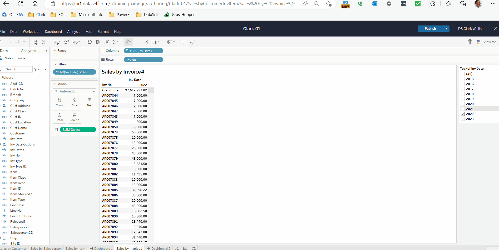
Adding Invoice Date as Exact Date
-
9. Drag and Drop: Multiple Dimensions
Tableau Help Link: Dimensions and Measures Intro (tableau.com)
Dimensions define how records are sorted and grouped, and how measures are subtotaled (aggregated).
Multiple Dimensions form a grouping hierarchy based on the order they display in the Rows or Columns.
The last Dimension shown is called the lowest level of detail, which is the level of the measure total.
Activity 7: Create a new worksheet showing Sales by Customer, Invoice No, Invoice Date, and Item in the last 2 years.
-
Create a new worksheet and insert Customer, Inv No, Inv Date and Item in the Rows.
-
Sizing Columns: Drag the row column lines to change widths.
TIP: For Dimensions select the column line within in the body of the rows.
       For Measures select the column line in the header area of the rows.
-
Rearranging Row Field Order: note how subtotals and row totals change.
On Rows, drag Customer to the middle of the fields (note the red down arrow when dragging and dropping fields - the down arrow indicates where the field will be inserted). Drag Customer to the far right and see how the data displays differently, then move it back to the left.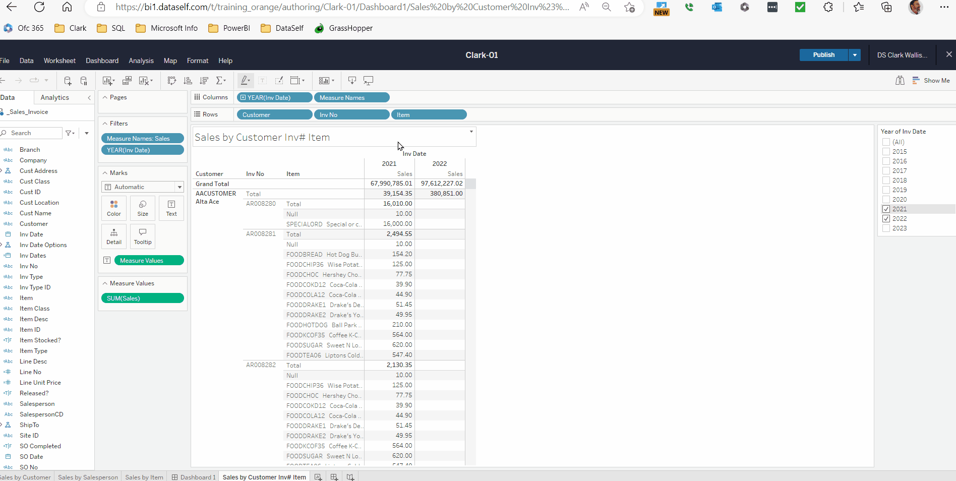
Note how the measure values change based on the grouping order of the fields. The last field in the rows determines the lowest level of detail.
10. Grand Totals and Subtotals
Activity 8: Modify the Sales by Customer InvoiceNo Item worksheet to add grand totals and subtotals.
-
Click the Sigma icon → Show Column Grand Totals.
TIP: Click the Sigma → Column Totals to Top. -
Click the Sigma icon → Add All Subtotals.
-
You can also add Row Grand Totals. Adding subtotals works for both columns and rows.
Add All Subtotals only adds subtotals for existing dimensions. If you add additional dimensions after the fact, they will not automatically have subtotals. This can be a handy feature if you only want certain dimensions subtotaled.
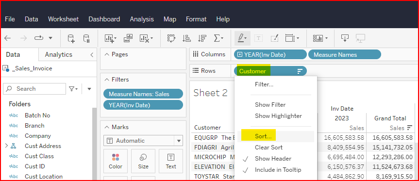
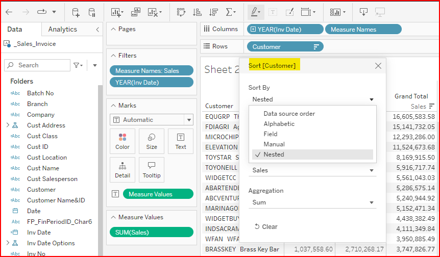
11. Sorting
Each Dimension can be sorted within the higher-level Dimension that it is grouped. This is called Nesting.
Tableau Help Link: Sort Data in a Visualization - Tableau
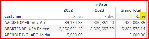
Activity 9: Sorting by Row Grand Totals
-
Go to the worksheet Sales by Customer and add Row Grand Totals.
-
Click the Sort icon on the Grand Total column header to change it from default order to Descending.
|
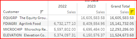
|
Note that the Sort Icon on the Customer heading shows a down arrow along with to descending icon. When you click on the arrow, you will see that the sort method is Nested. The nesting is based on the Grand Total of the sales per customer.
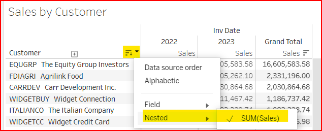
Sorting by Column and Row headers:
Each Column Header can display a sort icon to the right of the column name. As you click multiple times, it will cycle through default, descending, ascending sort order. There are also Sort Icons in the Icon bar at the top.
Alternate way to sort:
You can sort by a field by right clicking on the field in Rows or Columns section, then selecting Sort.
In the example below, it shows Nested because it had previously been sorted by the Row Grand Total.
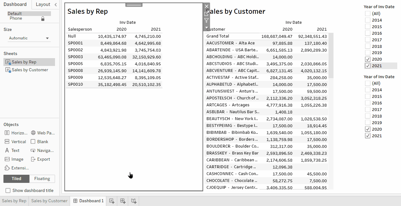
12. Dashboards
A Dashboard displays multiple worksheets (dashboard objects) within that workbook in one view.
You can add actions to make the different dashboard objects to make them interactive.
Activity 10: Create a Dashboard combining a Sales by Salesperson worksheet with a Sales by Customer worksheet as an interactive dashboard.
-
Verify your worksheets for Sales by Salesperson and Sales by Customer have filters set for the last two years.
-
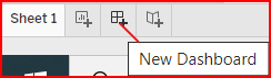
Create a new Dashboard sheet. On any sheet name (tab), right-click → New Dashboard. Or click on the 2nd new sheet icon.
-
On the Dashboard Sheet, in the top left, select Size → Fixed Size → Automatic.
-
In the left panel, drag the Sales by Salesperson worksheet into the Add sheets here area.
-
On the left panel, drag the Sales by Customer worksheet into the right of the dashboard area to insert it after the Sales by Rep.
-
Note the dashboard objects auto fit themselves on the sheet due to the Tiled property setting in the lower left corner.
-
Adjust the dashboard object sizes by moving the borders as desired.
-
Note the filters shown on the worksheets were automatically added to the Dashboards, which might result in duplicate filters. Select values on the filters and notice they only affect one object on the dashboard.
-
Making filters affect the whole workbook and removing duplicates:
-
Select a filter, click the arrow down button on the top right (or left) of the gray box around the filter, and select Apply to Worksheets → All Using This Data Source.
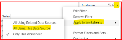
Change the filter selections and see how they affect the whole dashboard.
-
Remove duplicated filters by selecting them, and then clicking the X on the top right (or left) of the gray box around the filter.
-
13. Drill Down with Dashboards
-
Using dashboard object Action Filters:
-
Click on the Sales by Salesperson dashboard object.
-
On the top corner of the gray box around the object, click the Use as Filter icon.
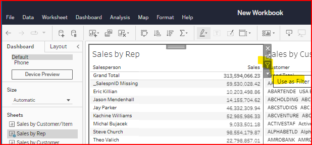
Click on data points within the Sales by Rep object and see that it selects only related data in the other dashboard objects.
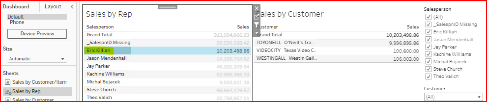
You can do the same with the Sales by Customer object to make it an action filter for Sales by Rep.
-
-
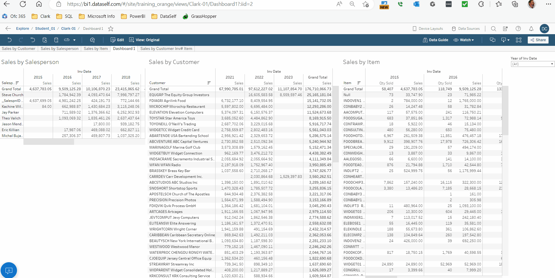
Add the Sales by Item worksheet to the dashboard and apply the action filter. Now you can filter by salesperson, customer, or item and see the interactions.
The example below includes the Sales by Item worksheet on the dashboard.
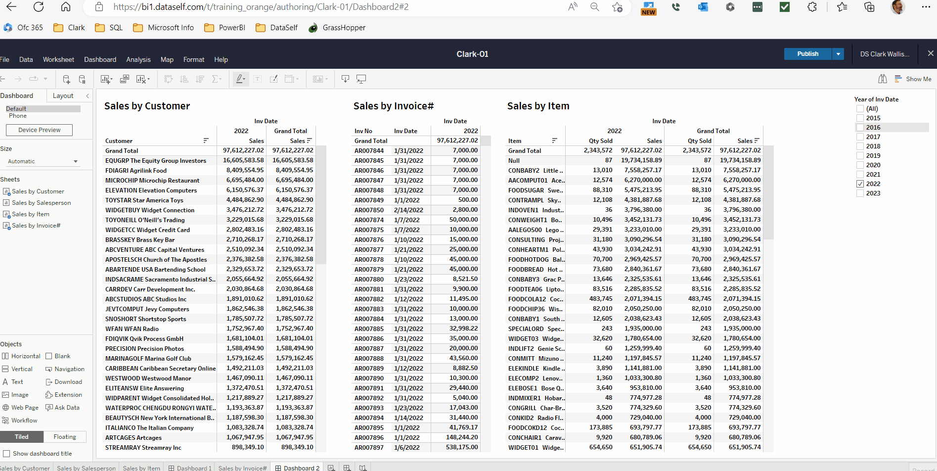
Activity 11: Create interactive Dashboard showing the worksheets: Sales by Customer, Sales by Inv No, and Sales by Item, to drill down from Customer to items on an invoice.
-
You already have worksheets for Sales by Customer, Inv No and Item.
-
Create a dashboard displaying Sales by Customer, Sales by Invoice#, and Sales by Item worksheets.
Make one of the Year of Invoice Date Filters apply to all worksheets using this Data Source and remove the extra filters.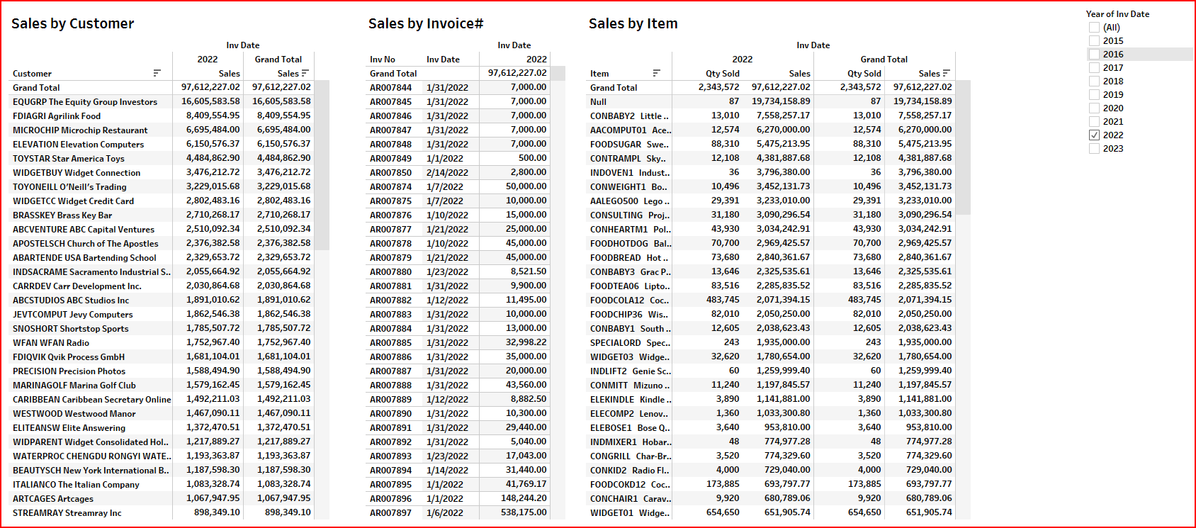
-
Activate the Use as Filter action filters for all three dashboard objects. Select one customer and see it shows only the invoices and items for that customer. Select one invoice and see it shows only the items for that invoice.
Next: Orange Belt: Report Design Part 2.