
0. Drill Down with Hierarchies
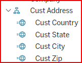
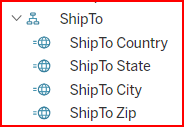
Drilling down is a function of Tableau Hierarchies. There are three types of hierarchies: Tableau built-in, DataSelf built-in, and custom workbook hierarchies. Built-in hierarchies cannot be modified in the Web App. All date type fields are subject to the Tableau built-in hierarchy of Year-Quarter-Month-Day. In the example below, the ShipTo Country is a DataSelf built-in hierarchy.
Drill Down with Built-in Hierarchies
Tableau built-in Hierarchies
Tableau has a built-in hierarchy for all Date or Datetime data fields that are not members of another hierarchy. The built in date hierarchy is: Year → Quarter → Month → Day. You cannot modify this built in hierarchy.
DataSelf built-in Hierarchies
DataSelf has created some hierarchies built into the data source. For example, the _Sales_Invoice dataset has built in hierarchy for ShipTo address data. Examples of DataSelf built-in Hierarchies are:
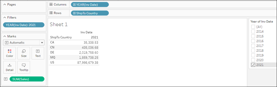
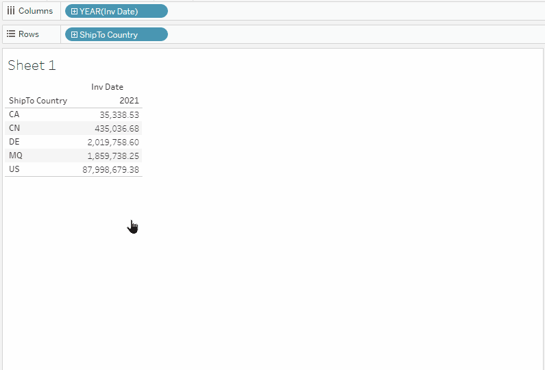
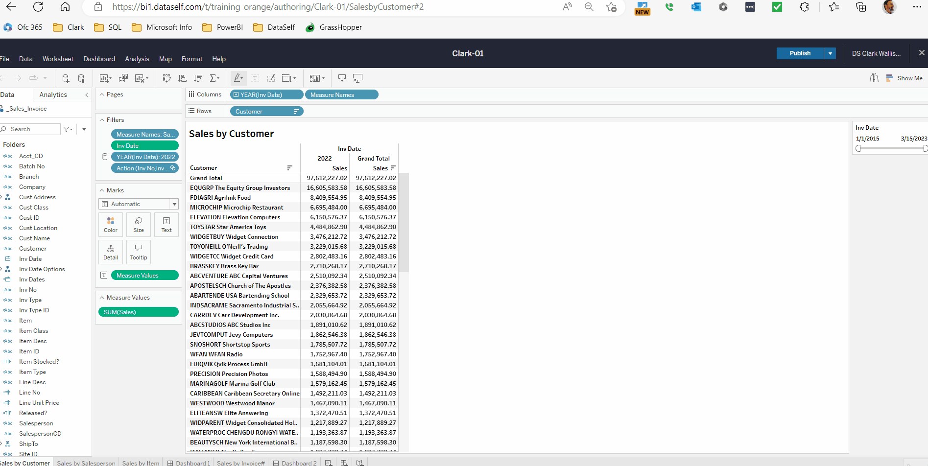
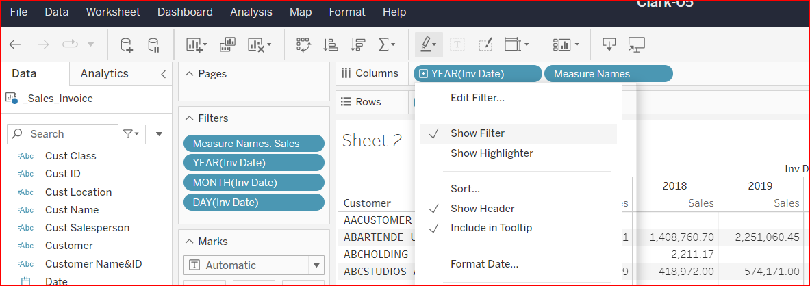
Activity 12: Create a sheet showing Sales by ShipTo per Inv Date Year column filtered for 2022.
-
-
Using the '+' icon on the Columns and Rows or column headers, drill down to the next hierarchy levels:
-
Expand (Drill down) on
ShipToCountry -> State -> City.
-
Expand (Drill down) on
Invoice DateYear > Quarter > Month > Day. -
Watch the video (no audio) for all variations.
-
Drill Down with Custom Hierarchies
Activity 13: Create a custom hierarchy to drill down from Customer > Inv No > Inv Date > Item.
-
On the left panel, right-click Customer > Hierarchy > Create Hierarchy. Name the Hierarchy Customer.Invoice.Item > Ok.
-
Add the Invoice No, Inv Date, and Item fields to the hierarchy.
Method 1: Drag the fields right below the Customer dimension inside of the new hierarchy.
Method 2: Right click on the field, select Hierarchy > Add to Hierarchy > Customer.Invoice.Item -
Create a view showing Sales by Customer.
-
Drill down all the way to Item.
-
Add All Subtotals, and Column Totals to Top.
TIP 1: A dimension cannot be in more than one hierarchy. ShipTo State already belongs to a DataSelf built-in hierarchy created in the Tableau data source (it can only be changed using Tableau Desktop). To work around such limitations, you can right-click a dimension → Duplicate. This will create a copy of that dimension and rename it. You can use the duplicated field in custom hierarchies.
TIP 2: If a date field is inserted into a hierarchy, it no longer follows the default Tableau hierarchy of Year→ Qtr→ Month→ Day. You can duplicate the date field and use the duplicate in the hierarchy so the original date field still follows the default Tableau date hierarchy
1. Downloading Data
-
Select a data point on a report.
-
On the pop-up menu, click the View Data grid icon.
-
A pop-up window displays with a summary of the data.
-
Click the Full Data tab to see the underlying data for the selected records.
-
Click on the Show Fields field in the upper right. Scroll to the top of the list to select All Fields.
This displays all the detail data for the selected records.
Click on the Download icon in the upper right to download as a CSV file.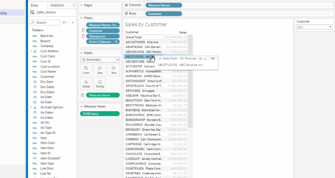
-
To download all the data in the data set to a chosen format, click on the download icon in upper right of the main screen. Select Data to download all data records as a CSV or Excel. Select PDF to download what you see on the screen.
Tip: Downloading in CSV format repeats all the columns on all the rows. The Excel format downloads the rows as seen on the screen.
2. Tableau Date Filters
Relative Date Filters
-
Build a view showing Sales by Year
-
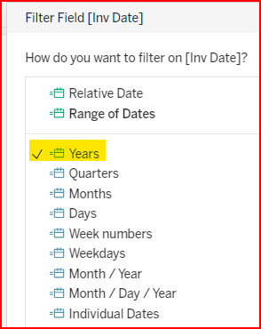
Drag and drop Inv Date into the Filters section. Note the different kinds of date filters available.
The first two (relative & range) are continuous date types. The others are discrete date types. We will discuss this more later on.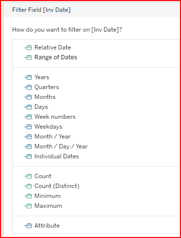
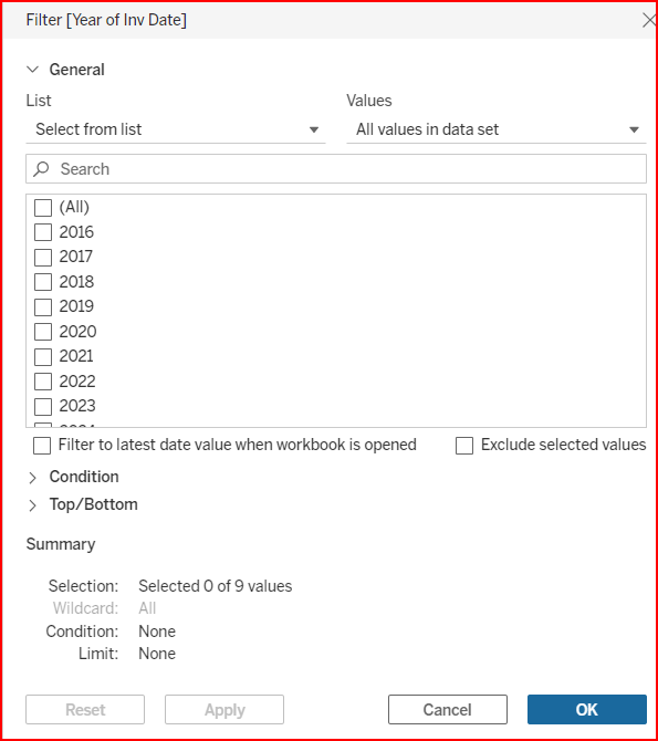
Select Relative Date as a starting point. Then right click to show the filter.
-
Relative Date: Select from a list of date periods relative to today’s date.
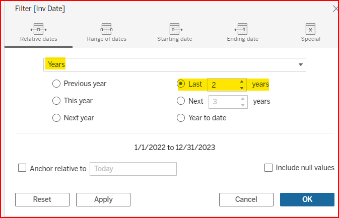
A common choice is selecting the Years time unit and Last 2 years as the relative timeline.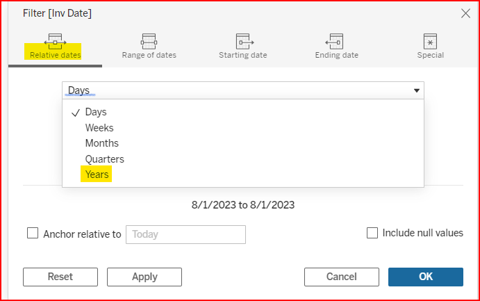
-
Click the arrow-down on the top-right of the filter card and explore the other options:
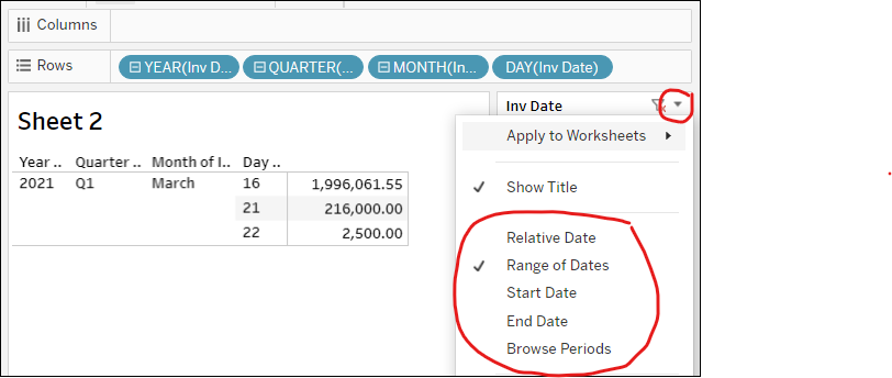
-
Range of Dates: enter any start and end date.
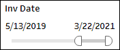
-
Start Date
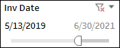
-
End Date
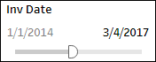
-
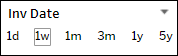
Browse Periods: 1d today, 1w (7 days) back, 1m (30 days) back, 3m (90 days) back, 1y (365 days) back, 5 years back.
-
See the screenshot below to view the options.
4. Example of using a discrete date filter instead of continuous date filter.
Duplicate the worksheet, then delete the Invoice Date field from the Filter section and add it again.
This time select #Year and show the filter. Note the different options.
Tableau Help Link: https://help.tableau.com/current/pro/desktop/en-us/filtering.htm#:~:text=or%20date%20fields.-,Filter%20categorical%20data%20(dimensions),-Dimensions%20contain%20discrete
Basic date comparison views using discrete date filters
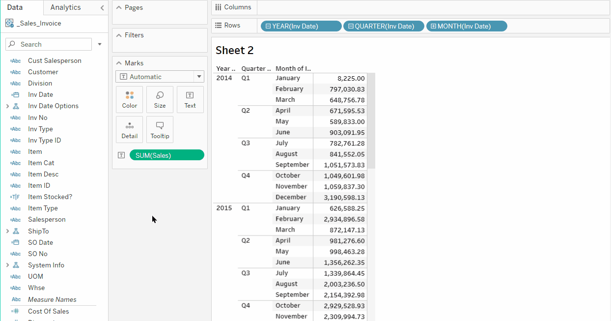
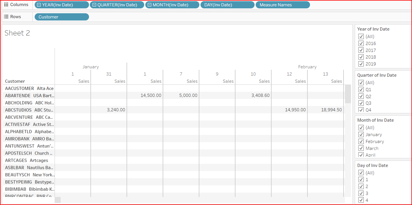
Optional Activity: Create view of Sales by Customer per Year. Show discrete filters for Year, Quarter, Month, Day
-
Start off with the Year in the column and show the filter.
-
Expand the Year to Quarter, Month, Day, and show filters for each.
-
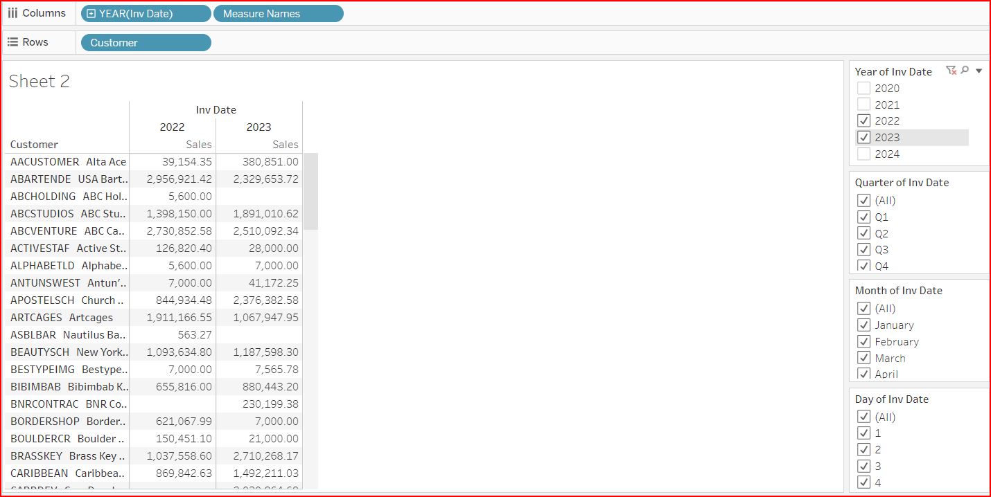
Collapse the Inv Date to only Year and select only the current and prior year.
-
You can filter the data to display for only specified Quarters, Months, or Days.
The example below shows Aug 1st - 3rd of 2022 & 2023. The Title was modified to show the Year, Month, and Day values selected.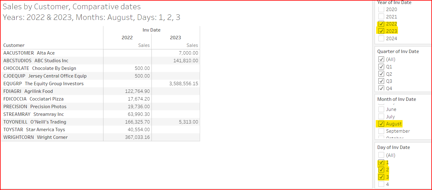
3. DataSelf Date Option Filters
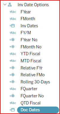
DataSelf adds special Inv Date Options fields to enhance reporting and filtering. See the screenshot below. Usually, these Date Option fields match with the company's fiscal period. Depending on your source system, these fields might come preconfigured to the calendar year or to the company's custom fiscal year. Consult DataSelf for details. Even though these fields are stored in a hierarchy, DataSelf used the hierarchy solely to group these custom fields together, not necessarily for a logical drilldown pattern.
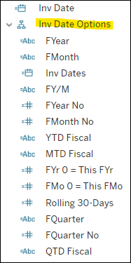
FYear, FQuarter, FMonth, and FY/M
For calendar based Fiscal Calendars, these date fields function similarly to the standard Inv Date field. Benefits of these fields:
-
Modified drill down order goes from FYear > FMonth > Inv Dates, skipping the FQuarter,
(but the drilldown order past that level is not logical). -
Can be configured to work with non-calendar based fiscal periods (such as 4-5-4 periods).
-
Easier to use in formulas (ex.: the number of a fiscal month is FMonth No, which is simpler than using Tableau’s formula: month (Inv Date)).
-
Sometimes the FY/M format is practical for filters or report headers.
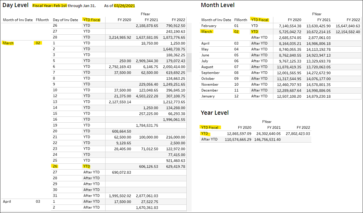
To-Date Periods: [YTD Fiscal], [QTD Fiscal], [MTD Fiscal]
The fields YTD Fiscal, QTD Fiscal and MTD Fiscal look at your fiscal period up to today’s date. The field displays YTD or After YTD. You can use it to group data or as a filter.
The following 3 examples consider a fiscal year starting on Feb the 1st and ‘today’ as 03/26/2021. Therefore, YTD Fiscal = YTD includes Feb 1 to Mar 26, and YTD Fiscal = After YTD covers Mar 27 to Jan 31.
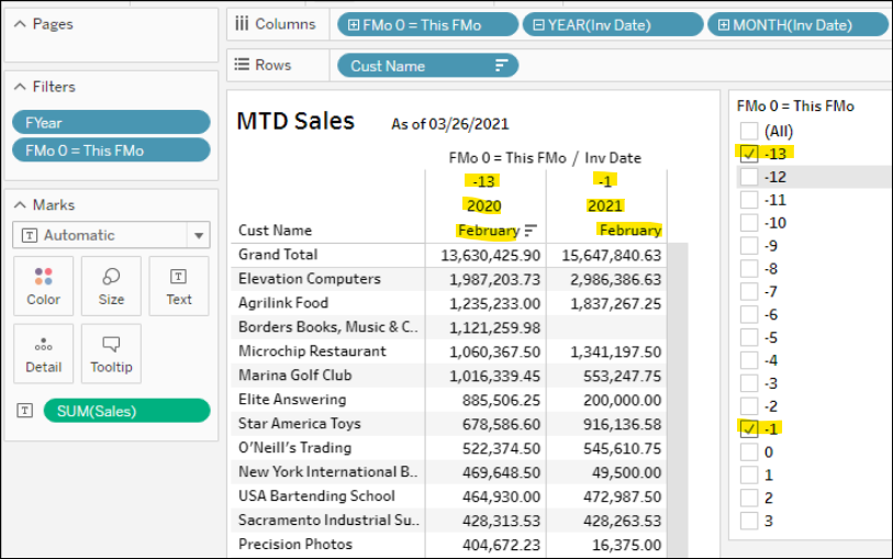
Relative Periods: [Relative FYr], [Relative FMo]
The field Relative FYr looks at the fiscal year compared to the Fiscal Year of today’s date. A 0 (zero) represents this fiscal year, -1 for prior fiscal year, -2 for two fiscal years ago, 1 for one future fiscal year. The same concept applies to Relative FMo, where 0 represents the current fiscal month, -1 is the prior fiscal month, -13 is the current month of the prior fiscal year.
The report below shows sales in the prior month (-1) compared to the same month in the prior year (-13).
Note, the field Relative FMo used to be named FMo 0 = This FMo depending on the version of DataSelf.
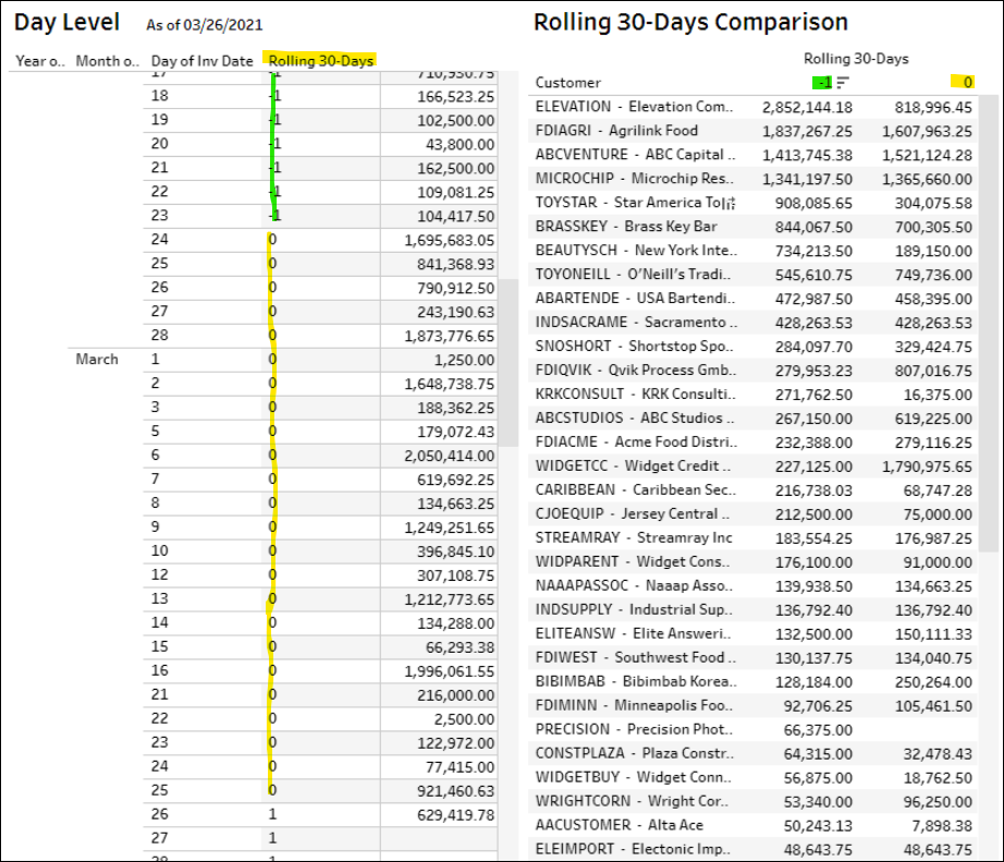
Rolling 30-Days (Relative 30 day units)
The field Rolling 30-Days looks at a moving 30-day window starting from today.
The report below shows the use-case for sales in the last 30-days (0 = Feb 24 to Mar 25) compared to the prior 30-day period (-1 = Jan 25 to Feb 23).
4. Formatting Measures
-
Right-click the green field of a report measure (on Rows, Columns, Marks, or Measures section) → Format Number → see the formatting options below:
-
Automatic.
-
Number: set decimal places, units (such as K for thousands) and thousand separators.
-
Currency: set currency with decimal places, units (such as K for thousands) and thousand separators.
-
Percentage: set decimal places.
-
Scientific: set decimal places.
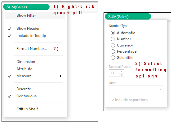
-
Tip: Tableau tends to make the default format for calculated fields to be integers with no decimals, so they might look different than the formatting of the standard measure fields (2 decimals). The solution is to format them as a Number and manually set them to 2 decimals.
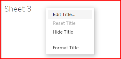
5. Report Title with Variables
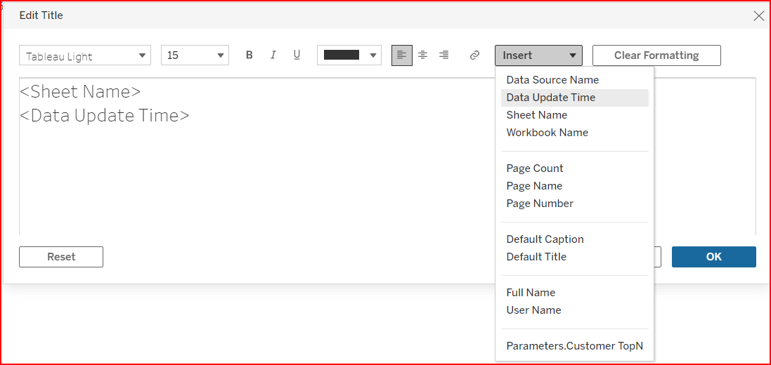
The Report Title shows at the top of the view and by default displays the worksheet name. You can edit the Title section to type your own text and insert merge fields of parameter, filter, and other fields used on the sheet.
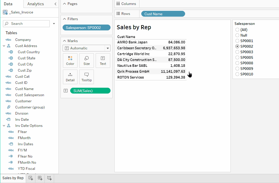
Activity: Add Salesperson Filter Selection to Title
For this exercise, build a report showing Sales by Customer filtered by Salesperson, and add to the view title the Salesperson filter selection and the time when the data was updated:
-
Hover the mouse over the report title → right click, or click the arrow down on the top right → Edit Title.
-
On the title expression, type a colon after <Sheet Name>, then click Insert → Salesperson → Apply.
-
See the change in the report title. Change the Salesperson filter values a see the title changes.
-
-
On the title expression, go to the next line, type in “As of “, click Insert → Data Update Time → Ok.
-
See the change in the report title.
-
Here are some of the options available in the Insert dropdown:
-
Data Update Time: Date/time when the Tableau data source was refreshed last time.
-
With certain data sources, you might want to use the data source’s Data as of field. This field is populated by the ETL and usually has a more accurate data extraction date/time. To use it: drag and drop it into the report’s Detail mark (center panel), and then insert it in the report title.
-
-
Sheet Name (the tab or view name).
-
Workbook Name (the Tableau workbook name).
-
The bottom section of the list shows data structures used in the report such as dimensions, measures, filters and parameters.
6. Colors and Charts 101
Tableau’s strength is in displaying data graphically to show patterns and exceptions.
The following are examples of using colors and charts in reports and dashboards.
Grid Report: Gradient Colors
To contrast or highlight large and small values, drag the desired measure to the Colors icon. See the following example:
-
Drag
Salesfrom the Data panel onto the Color icon. -
See how the colors change based on
Salesamount. -
Hover over the Sales column header and click the Sort icon to sort highest to lowest.
The colors gradually go from darker to lighter based on the sales amount.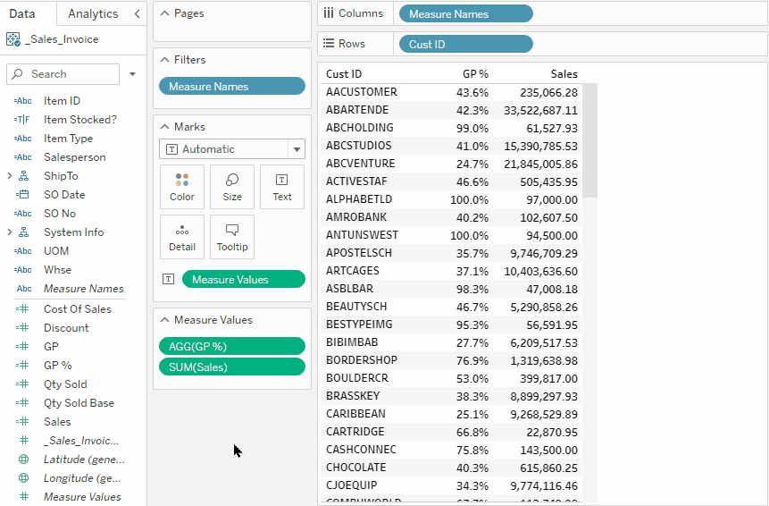
Grid Report: Stepped Colors
Use stepped colors to highlight segmented values, such as above and below a certain amount. For example:
-
Click the down arrow on the color legend.
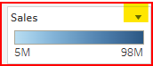
→ Edit Colors → select a Palette (i.e: Red-Black Diverging) → set Stepped color to 2 → Show Advanced → check Center → type in 1000000 → Enter → close the pop up.
-
Note that sales above 1M are now in black, the others in red.
Activity: built-in Highlight Tables format using the Show Me tool.
An alternative is to use the Show Me tool in the upper right corner of the screen. Select the Highlight Tables icon in the upper right to use background colors on grid reports (see meme below).
-
Use a view with a single measure → Show Me → Highlight Tables (top right icon).
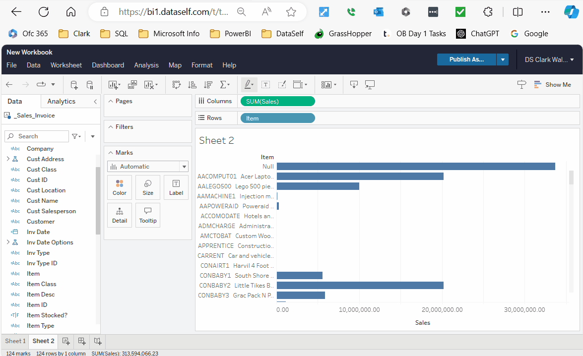
Activity: Bar Chart of Sales Per Item
-
Drag a dimension (Items) to Rows.
-
Drag a measure (Sales) to Columns, (don’t double click on the measure or drag it to the ABC section).
-
Sort: hover the cursor over the Sales label at the bottom of the screen and click on the sort highest to lowest icon. Or click on the Sort icon in the tool bar at the top of the screen and select sort descending.
-
Pivot: click Swap Rows and Columns icon.
-
Labels: Drag the measure from the data panel onto the Label icon (the Marks section in the center panel).
-
Formatting Labels: right-click the green sales measure in the Marks section → Format Number as desired. This formats how the Label value displays.
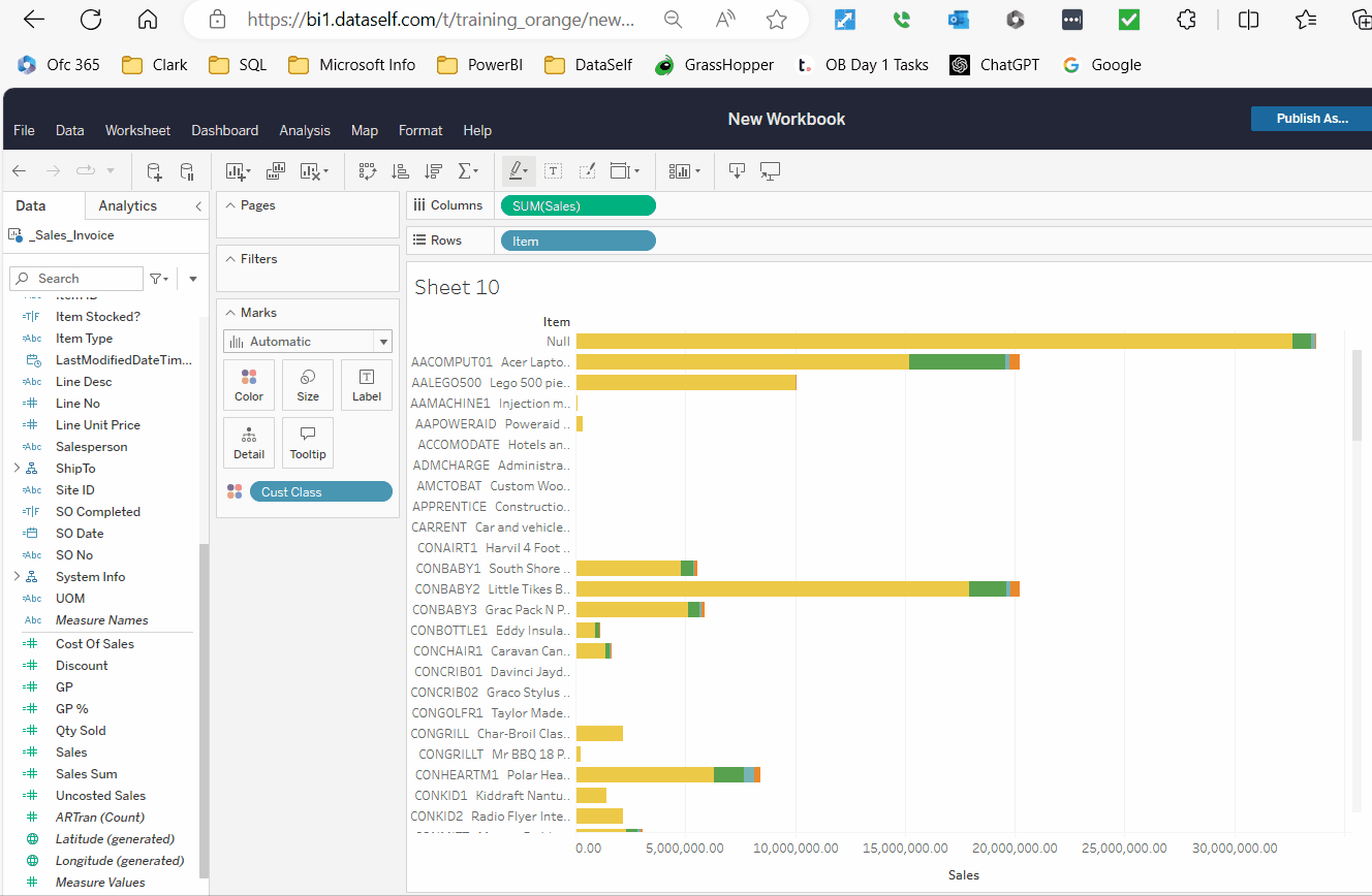
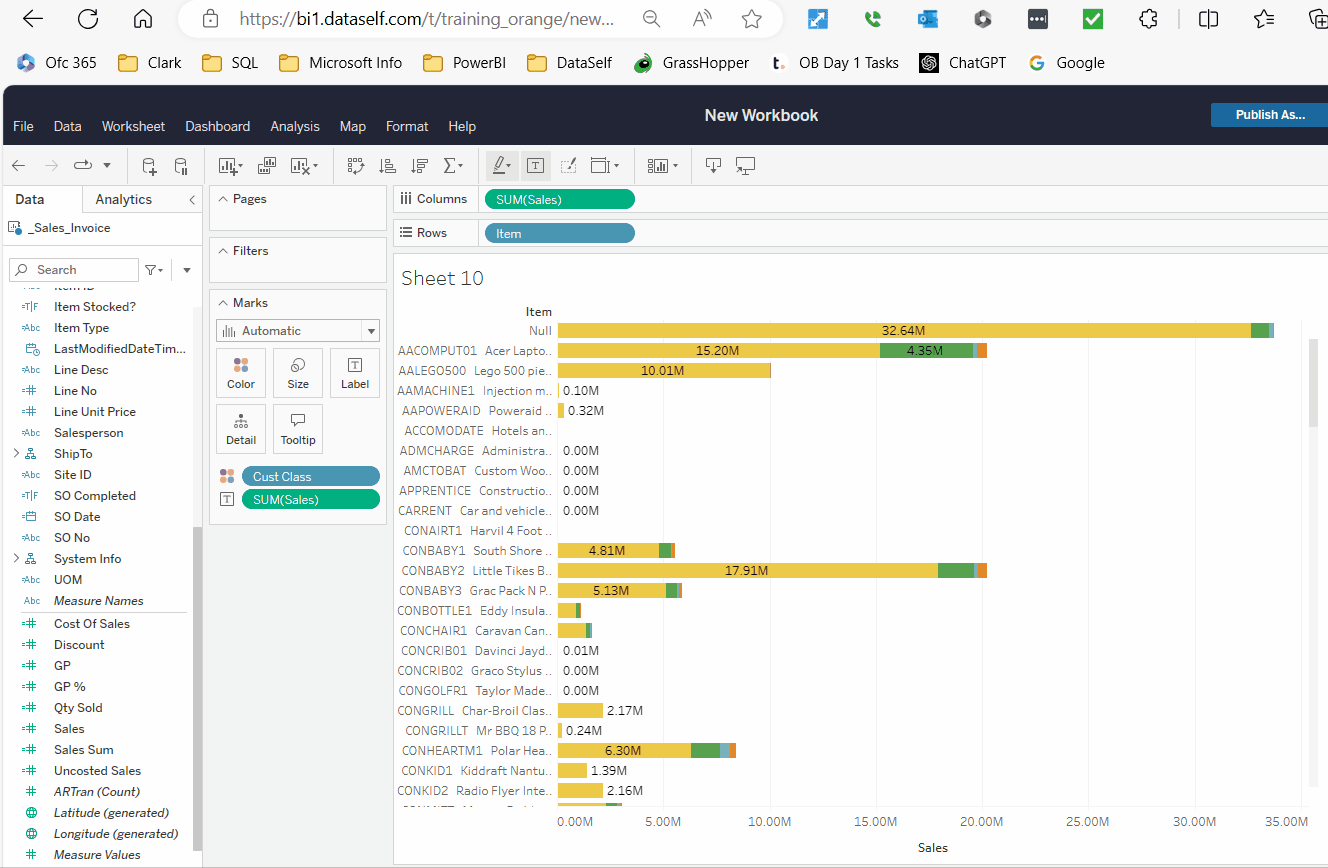
Activity: Bars Segmented by Other Dimensions
-
Duplicate the view above.
-
Drag
Customer Classfrom the data panel onto the Color mark (center panel).-
The Bars are segmented by color per the 2nd dimension field,
Customer Class.
-
-
Duplicate the view above.
-
Drag
Customer Classfrom the data panel onto Columns. Notice that Tableau automatically moves theSalesmeasure to be the last field in the columns.-
The Bars are grouped per the 2nd dimension field,
Customer Class.
-
-
Drag
Customer Classfrom Columns to Rows to see how it displays differently.
To see Subtotals per Cust Class, drag the Sales measure to the Label icon. This displays the total for each Cust Class. You might want to format the measure for a custom display.
To see Grand Totals for each bar, the Label tool does not do what you want. Instead, use the Reference Line feature on the Axis line.
Activity: How to create a Reference Line
Right Click on the Sales Axis. Add Reference Line. Select Cell, Computation = Sum, Label = Value.
Activity: Trend Lines by Year, Month and Year-over-Year
This activity shows the differences between displaying date fields as discrete values vs continuous values.
-
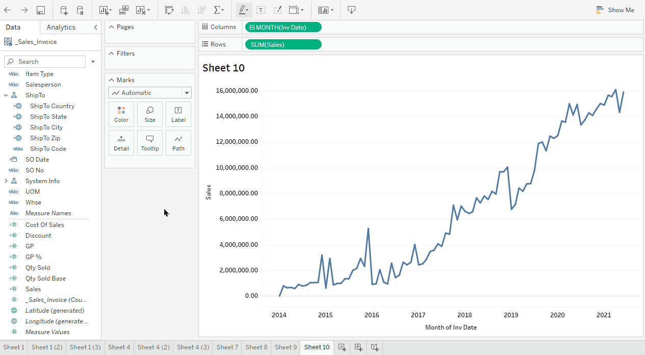
Create a new sheet.
-
Drag Inv Date to Columns.
-
Drag the
Salesmeasure to Rows.-
Tableau automatically determines a Trend line is the best format.
-
-
Duplicate the view above.
-
Right-click the YEAR (Inv Date) blue field (discrete) in Columns, select the format, Month (May 2015).
This changes the field to green, (continuous). A Trend line by year/month displays. -
Duplicate the view above.
-
Right-click the MONTH (Inv Date) green field, (continuous) in Columns select the format Month (May).
This changes the field to blue, (discrete). Now the trendline shows data by month regardless of the year. -
Drag Inv Date from the data panel and drop onto the Color mark (center panel).
-
This separates the years into different colored trend lines so you see the same month values year over year.
-
-
Labels and formatting: try the same as done in the Bars section.
To add grand totals to the year trend lines:
-
Add
Invoice Dateto the label mark and group it by Year. -
Add
Salesto the label mark. This shows the sales for only that mark. -
Change the Sum measure to a Running Total Table Calculation.
This shows the cumulative sales for each year trend line.
YouTube: Trend Lines showing grand total
Map of Sales by State
-
Select ShipTo State, press and hold the Ctrl button, select Sales.
-
On the top right, click Show Me and select the Maps icon on the center of the pop up.
-
Click Show Me again to hide the pop up.
-
That’s it! Sales by State!
-
-
From the view above, click Show Me on the top right, and select the Maps icon on the left.
-
Click Show Me again to hide it.
-
Drag Company from the data panel onto the Color mark (center panel).
-
On the Marks panel (center panel), click the dropdown list → Pie.
-
On the Marks panel (center panel), click the Size icon and drag it to the right.
-
That’s it! Sales by State by Company!
-
-
Labels and formatting: try the same as done in the Bars section.
-
Show Me Button
The Show Me button (top right) creates a view based on the fields already used in the view and any fields you’ve selected in the Data pane. Ex:
-
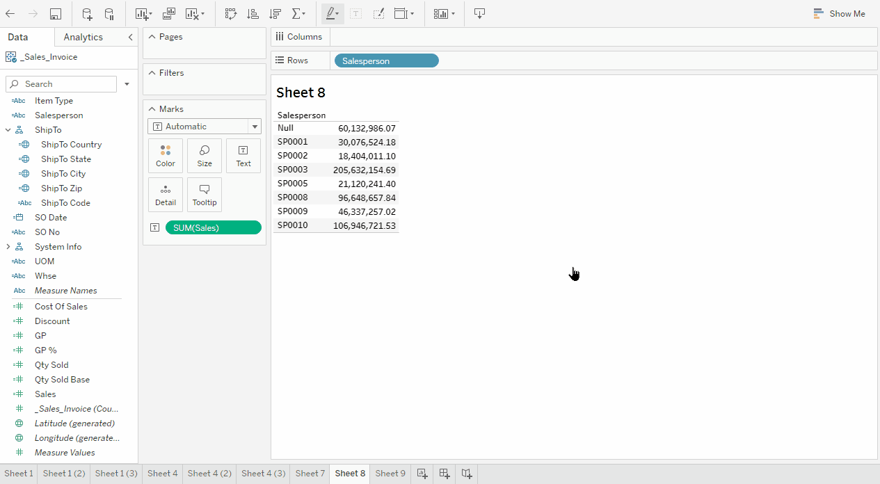
Build a report showing Sales by Salesperson.
-
Click the Show Me button on the top right, and explore the options available. See video.
-
Why many options are grayed out? Build a report showing Sales by Salesperson by Year and explore the options available.
-
Show Me enables options that apply to the fields selected in your report.
-
The orange square highlighted option is Tableau’s best guess of the best visualization for the selected fields.
-
-
Click here further Tableau info.
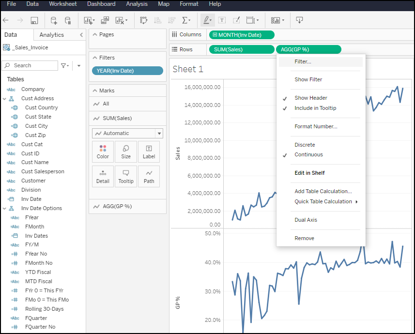
Dual Axis
-
Let’s see Sales and GP% trends on a dual axis chart.
-
Build a “trend line by month” chart like done above.
-
Drag GP % into Rows.
-
This shows Sales and GP% on a single X axis.
-
-
Click Show Me button → Dual Combination icon.
-
Click Show Me again to hide it.
-
Now this chart has dual Y axis headers, left with Sales, right with GP%.
-
-
To limit the chart’s period and seeing trends more clearly:
-
Filter report to start on Jan 2017 forward.
-
Click the Size in the Marks center panel, and drag it to the left.
-
To manually apply the Dual Axis feature, right click on the 2nd measure in the rows and select the option for Dual Axis
-