
The DataSelf Analytics workbook is provided Out-of-the-box ready to use for sales, inventory, and AP/AR information. These are descriptions of the worksheet views provided and what they do.
For more about this workbook see
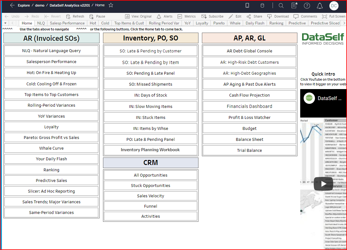
AR (Invoiced Sales Order) Section of the Out-of-the-box workbook, DataSelf Analytics v2202
|
|
Reviewing the Sales section of the Out-of-the-box workbook
|
Salesperson Performance
|
Chart measuring performance by salesperson, customer or item.
|
Hot: On Fire & Heating Up ***
|
Chart showing top activity and improving activity by customer, salesperson, item.
|
Cold: Cooling & Frozen ****
|
Chart showing decreasing activity and no activity by customer, salesperson, item.
|
Top Item to Top Customers
|
Tabular view of top sales for a given period by customer. |
Rolling - Period Variances
|
Tabular view of sales per custom time period showing comparisons & variances. I.e., current 30 days vs prior 30 days. |
YoY Variances *
|
Popular Chart showing YoY Sales, Gross Profit, Cost of Goods Sold, Qty Sold per customer or item.
|
Loyalty
|
Chart showing customers who continue to purchase over multiple years or not. |
Pareto: Gross Profit vs Sales
|
Chart comparing customer sales vs gross profit. Your highest sales customers are not always the most profitable customers. |
Whale Curve
|
Chart showing customer's contribution to the bottom line after including plugged overhead cost/invoice in the GP calculation. |
Your Daily Flash
|
Chart showing sales for a chosen date by salesperson, customer, item, ship-to city. |
Ranking
|
Tabular view ranking sales, cost of sales, and more. Display by customer, item, salesperson, invoice amt, and more. |
Predictive Sales
|
Line graph by Item Class & Year showing sales, cost of sales, gross profit, qty sold. The predictive function needs to be custom configured. |
Slicer: Ad Hoc Reporting **
|
Slice and dice sales data your way. Choose up to 4 subtotal categories and over 30 numeric values to total. All without writing any scripts. |
Sales Trends: Major Variances
|
Bar graph and line chart dashboard displaying sales for selected period of time presenting by month and YTD. A time-oriented view of sales. |
Same-Period Variances
|
Tabular view comparing sales, cost of sales, or gross profit for a selected year/month and same month prior year. |
Related Pages
-
Opening the Prebuilt "Out-of-the-box" DataSelf Workbook How to open this workbook.
-
How to select the information you want Filtering records shown in the reports.
NEXT: Sales Focus: YoY Variances - DataSelf - Confluence (atlassian.net)