The YoY Variances is the most popular OOTB view among our customers.
It allows you to quickly assess the performance of clients, sales representatives, products, and services. It provides insights into revenue performance, compares sales trends over time, and highlights changes in customer buying behavior.
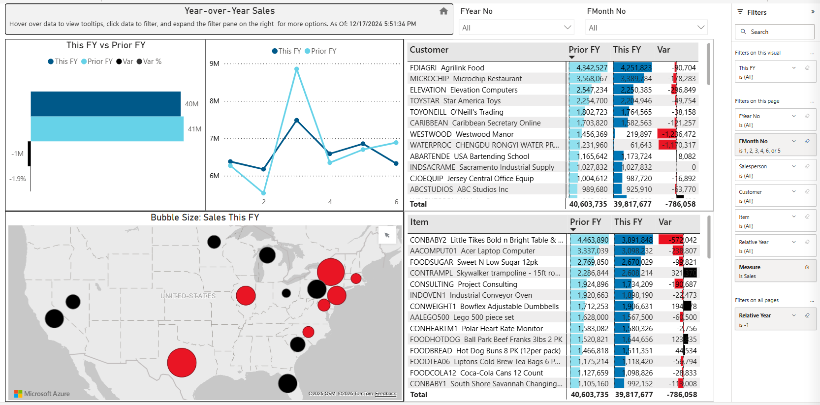
Reports Overview
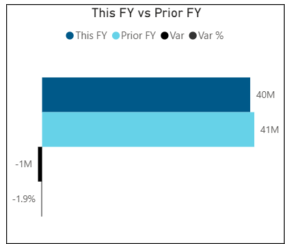
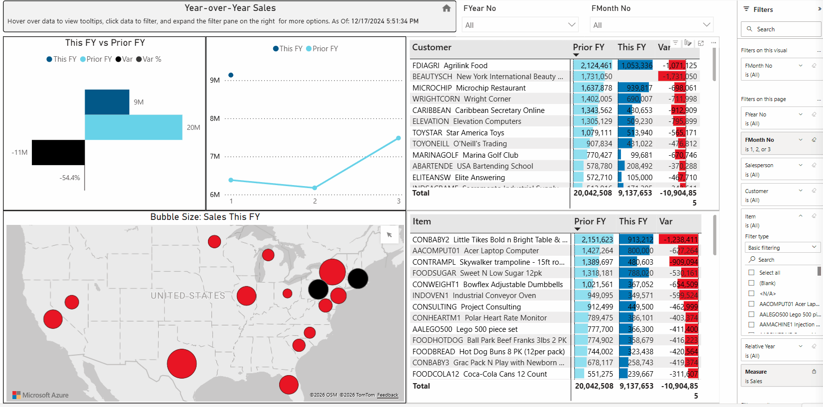
This FY vs Prior FY
This visual compares sales performance between the current financial year (This FY) and the previous financial year (Prior FY). It shows the variance in values and percentage change, allowing users to quickly identify whether performance has increased or decreased compared to the previous year.
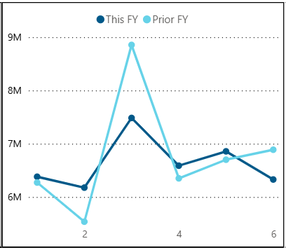
Line Chart - This FY vs Previous FY
This chart shows monthly sales for the current year compared to the previous year. It allows users to compare performance over time and identify trends, seasonality, and differences in sales between the two years.
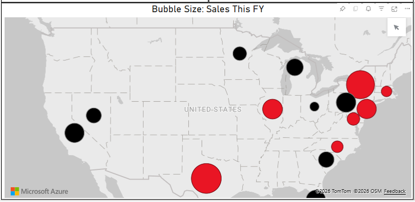
Bubble Size: Sales This FY
The map shows sales by state. The size of each bubble represents the sales amount, larger bubbles indicate higher sales.
If a bubble is red, it indicates a negative variance compared to the previous year. If it is black, it indicates a positive variance.
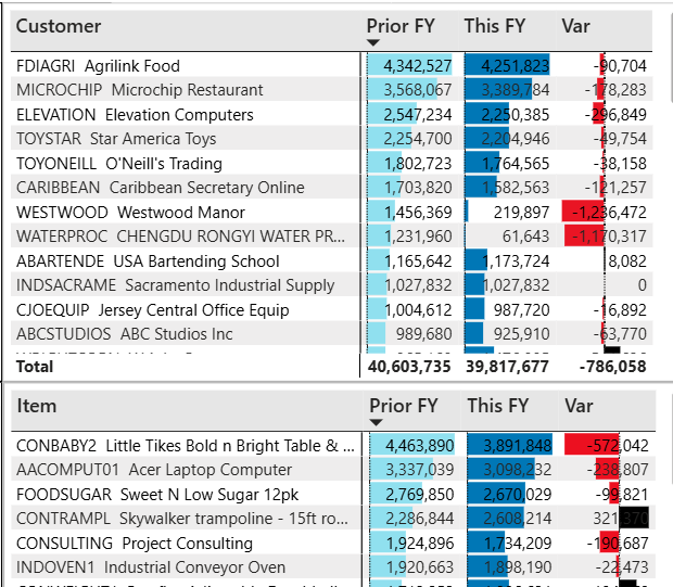
Customer and Item Charts
The Customer and Item charts on the right side of the dashboard show sales for the current year, previous year, and the variance by customer and item.
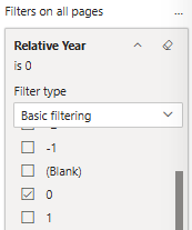
Report Filters
The filters are located on the right panel of the screen.
Relative Year: Select the base year, and the report will automatically compare it with the previous year. For example, if 0 is selected, it represents the current year, and the report compares the current year with the previous year.
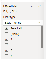
Months: Select the checkboxes for the months you want to include. In the visual, the dark blue represents the current year, while the lighter blue represents the previous year.
Salesperson, Customer, and Item filters allow you to search by typing. As you type, matching records are displayed, and you can select the desired values.
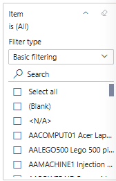
Selecting records using dimension filters
In the example below, “food” is entered in the Item filter to search for matching items. The user then selects the desired items using the checkboxes. Once selected, all other visuals automatically update to show sales for the selected items only. The dashboard is interactive.
Selecting records using Highlighting to show related data.
Below is an example of highlighting records to show related data.
The customer MICROCHIP is highlighted, so only the items and sales related to the highlighted customer display. To select multiple rows, use Control-Click.

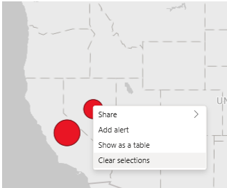
Selecting records on the map
To see customers & items in a specific geography, click on the map bubble to highlight and select only related data. In the example below the bubble in CA was highlighted, selecting only those customers and items sold in that geographical area.

You can highlight multiple records with Ctrl-Click. To un-highlight records, right-click and select Clear Selections.